Toolbelt.Blazor.SplitContainer
1.1.2.1
dotnet add package Toolbelt.Blazor.SplitContainer --version 1.1.2.1
NuGet\Install-Package Toolbelt.Blazor.SplitContainer -Version 1.1.2.1
<PackageReference Include="Toolbelt.Blazor.SplitContainer" Version="1.1.2.1" />
paket add Toolbelt.Blazor.SplitContainer --version 1.1.2.1
#r "nuget: Toolbelt.Blazor.SplitContainer, 1.1.2.1"
// Install Toolbelt.Blazor.SplitContainer as a Cake Addin
#addin nuget:?package=Toolbelt.Blazor.SplitContainer&version=1.1.2.1

// Install Toolbelt.Blazor.SplitContainer as a Cake Tool
#tool nuget:?package=Toolbelt.Blazor.SplitContainer&version=1.1.2.1
Blazor SplitContainer 
Summary
A Blazor component to create panes separated by a slidable splitter bar.
Note
I know the same feature component library, the "BlazorSliders", already exists, but it was a bit unsmooth, particularly on Blazor Server apps. So I've decided to create another one on my hand.
How to use
Installation
- Add package to your project like this.
dotnet add package Toolbelt.Blazor.SplitContainer
- Open
Toolbelt.Blazor.Splitternamespace in_Imports.razorfile.
@* This is "_Imports.razor" *@
...
@using Toolbelt.Blazor.Splitter
- Then you can use the
SplitContainercomponent in your Blazor app.
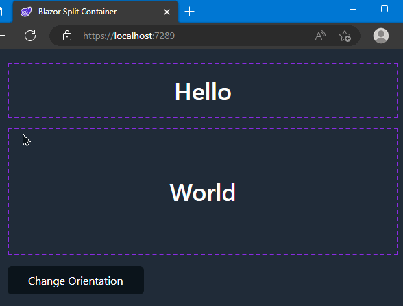
<SplitContainer @bind-FirstPaneSize="_PaneSize">

    <FirstPane>
        <h1>Hello</h1>
    </FirstPane>

    <SecondPane>
        <h1>World</h1>
    </SecondPane>

</SplitContainer>

@code {
    private int _PaneSize = 80;
}
NOTICE: Including CSS style sheet
This package assumes that the application uses Blazor's CSS isolation by default. Usually, this pre-requirement is appropriate. However, unfortunately, some Blazor projects scenario, such as those made by the "empty" project template, are not configured for CSS isolation. In this case, the CSS file of this package will never be loaded in the app, and the Splitter Container component will not work. To resolve this issue, you must include this package's CSS file by yourself.
Specifically, you should include the bundled CSS file for the project in the fallback HTML document file, like the following code,
<!DOCTYPE html>
<html lang="en">
<head>
    ...

    <link href="{ASSEMBLY NAME}.styles.css" rel="stylesheet" />
    ....
or include the CSS file for this package individually, like the following code.
<!DOCTYPE html>
<html lang="en">
<head>
    ...

    <link href="_content/Toolbelt.Blazor.SplitContainer/Toolbelt.Blazor.SplitContainer.bundle.scp.css"
        rel="stylesheet" />
    ...
See also: https://learn.microsoft.com/aspnet/core/blazor/components/css-isolation
Parameters
| Parameter Name | Type | Description |
|---|---|---|
| Id | string? | Gets or sets an id string applied for the "id" attribute of the split container element. |
| Style | string? | Gets or sets a CSS style string applied for the "style" attribute of the split container element. |
| Class | string? | Gets or sets a CSS class string applied for the "class" attribute of the split container element. |
| FirstPane | RenderFragment | The left or top pane in the SplitContainer. |
| SecondPane | RenderFragment | The right or bottom pane in the SplitContainer. |
| Orientation | SplitterOrientation | Determines if the spliter is vertical or horizontal. The default value is SplitterOrientation.Vertical. |
| FirstPaneSize | int? | Determines pixel distance of the splitter from the left or top edge. |
| FirstPaneMinSize | int? | Determines the minimum distance of pixels of the splitter from the left or the top edge of first pane. |
| SecondPaneSize | int? | Determines pixel distance of the splitter from the right or bottom edge. |
| SecondPaneMinSize | int? | Determines the minimum distance of pixels of the splitter from the right or the bottom edge of second pane. |
| FirstPaneSizeChanged | EventCallback<int> | A callback that will be invoked when the size of the first pane is changed. |
| SecondPaneSizeChanged | EventCallback<int> | A callback that will be invoked when the size of the second pane is changed. |
Warning
You can specify the pane size to only either theFirstPaneSizeor theSecondPaneSizeparameter. If you specify both theFirstPaneSizeor theSecondPaneSizeparameters, then the splitter won't work.
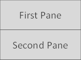
Orientation
The Orientation parameter represents the "Splitter Bar" orientation that splits the SplitContainer's client area into two panes. The following figures show the layout you will see with each SplitterOrientation enum value set to the Orientation parameter.
| Vertical | Horizontal |
|---|---|
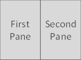 |
 |
Pane size
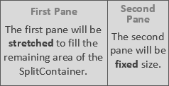
When you set the FirstPaneSize parameter, the first pane will be fixed size, and the second pane will be stretched to fill the remaining area of the SplitContainer.
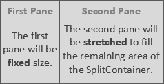
On the other hand, when you set the SecondPaneSize parameter, the first pane will be stretched to fill the remaining area of the SplitContainer, and the second pane will be fixed size.
⚠️ Warning
I strongly recommend binding a pane size parameter to a field variable, like the following example.
<SplitContainer @bind-FirstPaneSize="_PaneSize">
    ...
</SplitContainer>

@code {
    private int _PaneSize = 80;
}
When you set a pane size parameter with a literal value, like below,
<SplitContainer FirstPaneSize="80">
    ...
</SplitContainer>
the pane size might be reset unintendedly to that literal value you specified even after a user has operated to resize the pane.
Save and restore the pane size
Please refer to the following example if you want to save and restore the pane size. The following example shows you how to save and restore the pane size into a web browser's local storage (The example uses the Blazored.LocalStorage NuGet package to access the web browser's local storage API).
@inject ILocalStorageService LocalStorage

<SplitContainer @bind-FirstPaneSize="_PaneSize"
                @bind-FirstPaneSize:after="OnPaneSizeChanged">
    ...
</SplitContainer>

@code {
  private int _PaneSize = 80;

  protected override async Task OnAfterRenderAsync(bool firstRender)
  {
    if (firstRender)
    {
      var paneSizeStr = await this.LocalStorage.GetItemAsStringAsync("_PaneSize");
      if (int.TryParse(paneSizeStr, out var paneSize)) this._PaneSize = paneSize;
      this.StateHasChanged();
    }
  }

  private async Task OnPaneSizeChanged()
  {
    await this.LocalStorage.SetItemAsStringAsync("_PaneSize", _PaneSize.ToString());
  }
}
Change the size of the splitter bar
The size of the splitter bar is defined by the CSS custom property named --splitter-bar-size scoped in the split-container CSS class (The default value is '4px'). So you can change the size of the splitter bar by overriding that CSS custom property value like the following example.
::deep .split-container {
    --splitter-bar-size: 14px;
}
Release Note
License
| Product | Versions Compatible and additional computed target framework versions. |
|---|---|
| .NET | net6.0 is compatible. net6.0-android was computed. net6.0-ios was computed. net6.0-maccatalyst was computed. net6.0-macos was computed. net6.0-tvos was computed. net6.0-windows was computed. net7.0 was computed. net7.0-android was computed. net7.0-ios was computed. net7.0-maccatalyst was computed. net7.0-macos was computed. net7.0-tvos was computed. net7.0-windows was computed. net8.0 was computed. net8.0-android was computed. net8.0-browser was computed. net8.0-ios was computed. net8.0-maccatalyst was computed. net8.0-macos was computed. net8.0-tvos was computed. net8.0-windows was computed. |
-
net6.0
- Microsoft.AspNetCore.Components.Web (>= 6.0.0)
NuGet packages (1)
Showing the top 1 NuGet packages that depend on Toolbelt.Blazor.SplitContainer:
| Package | Downloads |
|---|---|
|
BlazingStory
The clone of "Storybook" for Blazor, a frontend workshop for building UI components and pages in isolation. |
GitHub repositories
This package is not used by any popular GitHub repositories.
v.1.1.2.1
Improve README - mentioned the CSS isolation
To see all the change logs, please visit the
following URL.
-
https://github.com/jsakamoto/Toolbelt.Blazor.SplitContainer/blob/main/RELEASE-NOTES.txt