BlazorEnumSelect.ToreAurstadIT
1.0.0
See the version list below for details.
dotnet add package BlazorEnumSelect.ToreAurstadIT --version 1.0.0
NuGet\Install-Package BlazorEnumSelect.ToreAurstadIT -Version 1.0.0
<PackageReference Include="BlazorEnumSelect.ToreAurstadIT" Version="1.0.0" />
paket add BlazorEnumSelect.ToreAurstadIT --version 1.0.0
#r "nuget: BlazorEnumSelect.ToreAurstadIT, 1.0.0"
// Install BlazorEnumSelect.ToreAurstadIT as a Cake Addin
#addin nuget:?package=BlazorEnumSelect.ToreAurstadIT&version=1.0.0

// Install BlazorEnumSelect.ToreAurstadIT as a Cake Tool
#tool nuget:?package=BlazorEnumSelect.ToreAurstadIT&version=1.0.0
Enum select sample
License: MIT
You can adapt this sample to your convenience. I created this component to learn more about Blazor. It is built upon sample code from user meziantou on SO and packaged and added some functionality.
Possible improvemen I would like to see in a fork:
- In case your enum contains many values, a search / filtering capability like that of select2.js could be added. (this should be possible to turn on or off)
- A similar control that displays radio button group instead.
This solution consists of a sample .NET 5.0 Blazor WASM client with Blazorise and Font Awesome added and a class library with an enum select control, i.e. a customized InputSelect control which is adapted for an enum property of a model you pass in - this custom controls supports data binding since it inherits from the InputSelect control of Blazor and just adds more functionality to it.
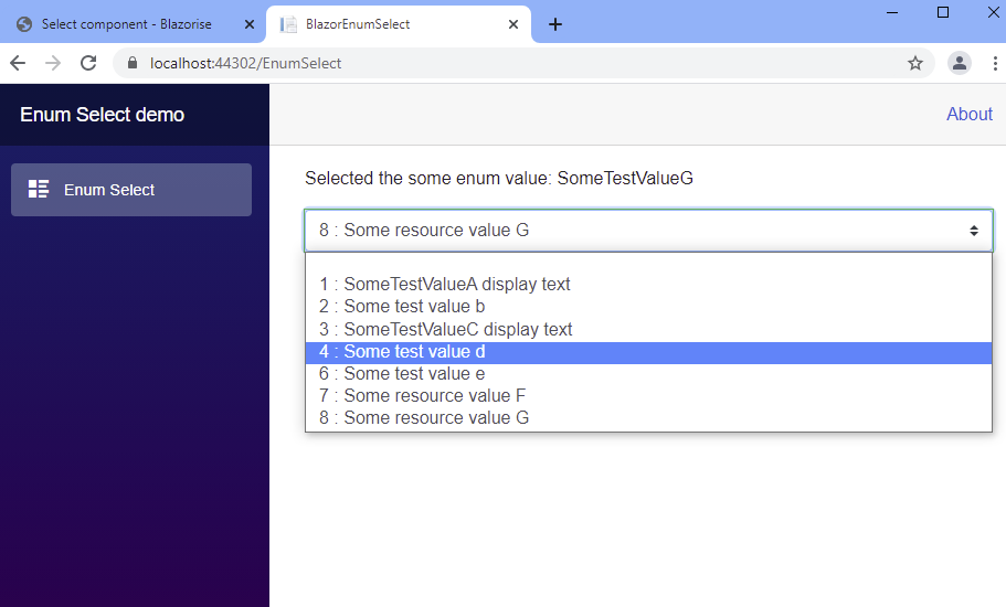
The adapted functionality is to display the enum value, to sort the int values of the enum values ascending, to allow specifying an enum value with empty text and allow you to pass in the additional css class(es) to adapt the look of the select element of this control. For example, to use the Blazorise look, you can set the enum value "custom-select", after adding Blazorise into your WASM app. This is shown in the sample client.
Install the package:
Install-Package BlazorEnumSelect.ToreAurstadIT
This razor class library contains a Blazor control that allows data binding to a property of type enum (nullable enums are supported).
This sample is built upon the source code presented in the article here: https://www.meziantou.net/creating-a-inputselect-component-for-enumerations-in-blazor.htm
In addition, this control contains some additional parameters to control the rendering output:
Parameters
| Parameter | Datatype | Usage (default value) |
|---|---|---|
| ShowIntValues | bool | Shows the enum value prefixing the text separated by a colon letter :. (default is true) |
| EmptyTextValue | int? | Define the int? value of the enum where we will have empty text (default is null) |
| AdditionalCssClasses | string | List up css classes separated by space that will be added to the select element. E.g. Blazorise uses 'custom-select' as css class for its select element |
Sample usage
The enum control supports data binding and is easy to use.
@page "/EnumSelect"

@using  ToreAurstadIT.BlazorEnumSelect.SampleClient.Models

<EditForm Model="@model">
    <span>Selected the some enum value: @model.SomeEnum</span>
    <ToreAurstadIT.BlazorEnumSelect.ClassLibrary.InputSelectEnum @bind-Value="@model.SomeEnum"
                                                    EmptyTextValue="-1" ShowIntValues="true"
                                                    AdditionalCssClasses="custom-select">
    </ToreAurstadIT.BlazorEnumSelect.ClassLibrary.InputSelectEnum>
</EditForm>

@code{
    public SomeWrappingClassWithSomeEnum model = new SomeWrappingClassWithSomeEnum();
}
Building this library into a Nuget
Run the following command after bumping Version element value
From ToreAurstadIT.BlazorEnumSelect.ClassLibrary folder :
echo Building the library and packing it. Remember to increase the version attribute value
echo of the csproj before pushing to nuget
dotnet build  --configuration Release
dotnet pack --configuration Release
Then upload the .nupkg file from the bin\Release folder of the class library.
| Product | Versions Compatible and additional computed target framework versions. |
|---|---|
| .NET | net5.0 is compatible. net5.0-windows was computed. net6.0 was computed. net6.0-android was computed. net6.0-ios was computed. net6.0-maccatalyst was computed. net6.0-macos was computed. net6.0-tvos was computed. net6.0-windows was computed. net7.0 was computed. net7.0-android was computed. net7.0-ios was computed. net7.0-maccatalyst was computed. net7.0-macos was computed. net7.0-tvos was computed. net7.0-windows was computed. net8.0 was computed. net8.0-android was computed. net8.0-browser was computed. net8.0-ios was computed. net8.0-maccatalyst was computed. net8.0-macos was computed. net8.0-tvos was computed. net8.0-windows was computed. |
-
net5.0
- humanizer.core (>= 2.10.1)
- Microsoft.AspNetCore.Components.Web (>= 5.0.6)
NuGet packages
This package is not used by any NuGet packages.
GitHub repositories
This package is not used by any popular GitHub repositories.
First release