BlazorEnumSelect.ToreAurstadIT
1.2.0
dotnet add package BlazorEnumSelect.ToreAurstadIT --version 1.2.0
NuGet\Install-Package BlazorEnumSelect.ToreAurstadIT -Version 1.2.0
<PackageReference Include="BlazorEnumSelect.ToreAurstadIT" Version="1.2.0" />
paket add BlazorEnumSelect.ToreAurstadIT --version 1.2.0
#r "nuget: BlazorEnumSelect.ToreAurstadIT, 1.2.0"
// Install BlazorEnumSelect.ToreAurstadIT as a Cake Addin
#addin nuget:?package=BlazorEnumSelect.ToreAurstadIT&version=1.2.0

// Install BlazorEnumSelect.ToreAurstadIT as a Cake Tool
#tool nuget:?package=BlazorEnumSelect.ToreAurstadIT&version=1.2.0
Enum select sample
License: MIT
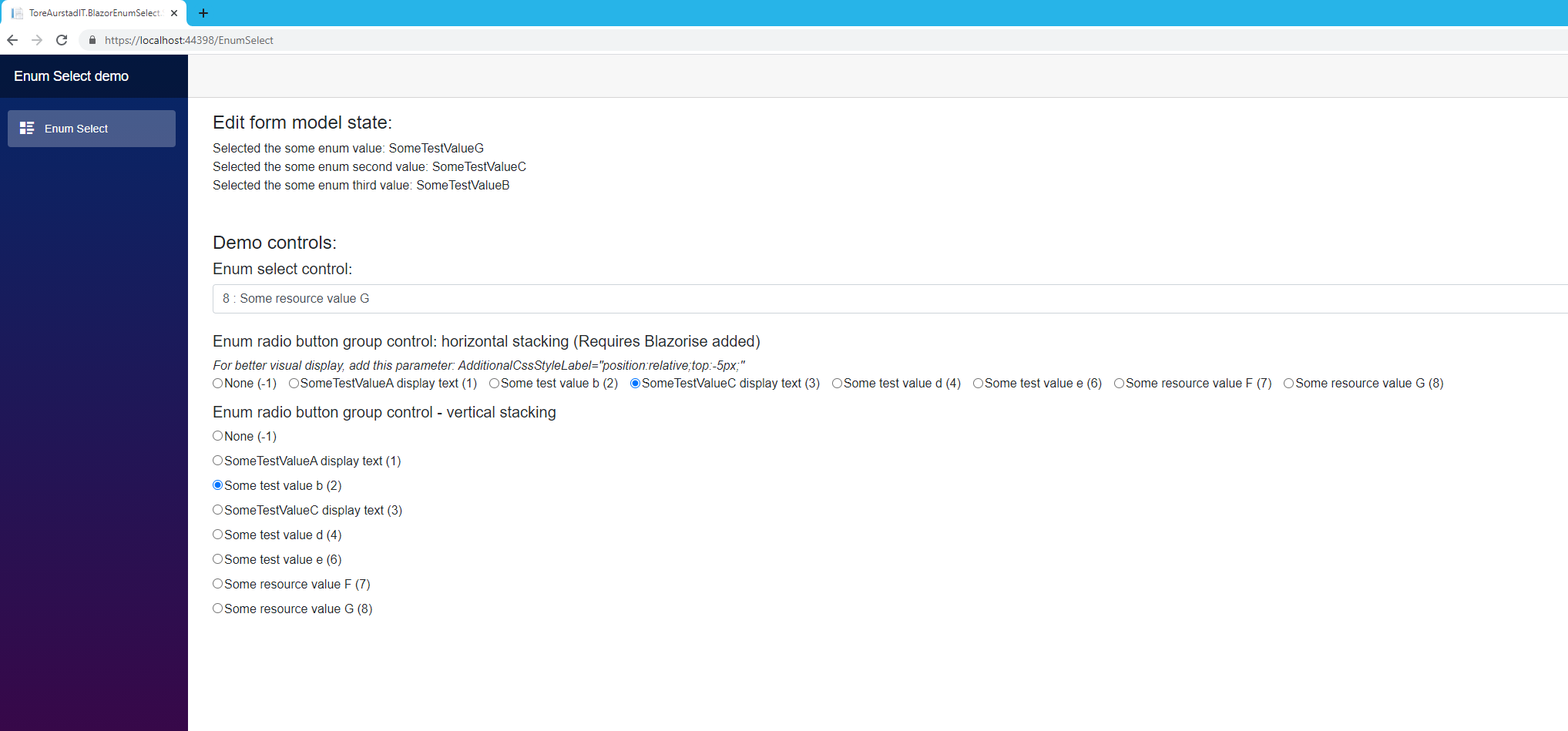
Image showing the two input controls /components included in this small library. (The InputRadioGroupEnum control supports vertical and horizontal stacking).
You can adapt this sample to your convenience. I created this component to learn more about Blazor. It is built upon sample code from user meziantou on SO and packaged and added some functionality.
Possible improvemen I would like to see in a fork:
- In case your enum contains many values, a search / filtering capability like that of select2.js could be added. (this should be possible to turn on or off)
This solution consists of a sample .NET 5.0 Blazor WASM client with Blazorise and Font Awesome added and a class library with an enum select control, i.e. a customized InputSelect control which is adapted for an enum property of a model you pass in - this custom controls supports data binding since it inherits from the InputSelect control of Blazor and just adds more functionality to it.
This package now also includes an input radio button group control for enums.
Install the package:
Install-Package BlazorEnumSelect.ToreAurstadIT
This razor class library contains a Blazor control that allows data binding to a property of type enum (nullable enums are supported).
This sample is built upon the source code presented in the article here: https://www.meziantou.net/creating-a-inputselect-component-for-enumerations-in-blazor.htm
InputSelect control
This is a select (drop down list) control for Blazor wasm that can bind to enum properties. It supports data binding and resource files for localized text. It inherits from the InputSelect control of Blazor. (so it has the same features as this control, and added customization)
In addition, this control contains some additional parameters to control the rendering output:
Parameters
| Parameter | Datatype | Usage (default value) |
|---|---|---|
| ShowIntValues | bool | Shows the enum value prefixing the text separated by a colon letter :. (default is true) |
| EmptyTextValue | int? | Define the int? value of the enum where we will have empty text (default is null) |
| AdditionalCssClasses | string | List up css classes separated by space that will be added to the select element. E.g. Blazorise uses 'custom-select' as css class for its select element |
Sample usage
The enum control supports data binding and is easy to use.
@page "/EnumSelect"

@using  ToreAurstadIT.BlazorEnumSelect.SampleClient.Models

<EditForm Model="@model">
    <span>Selected the some enum value: @model.SomeEnum</span>
    <ToreAurstadIT.BlazorEnumSelect.ClassLibrary.InputSelectEnum @bind-Value="@model.SomeEnum"
                                                    EmptyTextValue="-1" ShowIntValues="true"
                                                    AdditionalCssClasses="custom-select">
    </ToreAurstadIT.BlazorEnumSelect.ClassLibrary.InputSelectEnum>
</EditForm>

@code{
    public SomeWrappingClassWithSomeEnum model = new SomeWrappingClassWithSomeEnum();
}
InputRadioGroupEnum control
This is a input radio button group control (drop down list) for Blazor wasm that can bind to enum properties. It supports data binding and resource files for localized text. It inherits from the InputRadioGroup control of Blazor. (so it has the same features as this control, and added customization)
In addition, this control contains some additional parameters to control the rendering output:
Parameters
| Parameter | Datatype | Usage (default value) |
|---|---|---|
| ShowIntValues | bool | Shows the enum value prefixing the text separated by a colon letter :. (default is true) |
| EmptyTextValue | int? | Define the int? value of the enum where we will have empty text (default is null). For now this is NOT supported as it is not the same 'natural feel' like in a Select control. Not implemented yet. |
| AdditionalCssClasses | string | List up css classes separated by space that will be added to the input radio element. E.g. Blazorise uses 'custom-control-input' as css class for its input radio element. But for now - do not use this css class as it gives errors. See sample instead for correct use of this control. |
| AdditionalCssClassesDiv | string | List up css classes separated by space that will be added to the wrapping div. E.g. Blazorise uses 'custom-control custom-radio custom-control-inline' as css class for its div element. But for now - do not use this css class as it gives errors. See sample instead for correct use of this control. |
| AdditionalCssClasses | string | List up css classes separated by space that will be added to the input radio element. E.g. Blazorise uses 'custom-control-input' as css class for its select element. But for now - do not use this css class as it gives errors. See sample instead for correct use of this control. |
| AdditionalCssClassesLabel | string | List up css classes separated by space that will be added to the label for the input radio element. E.g. Blazorise uses 'custom-control-label' as css class for its select element. But for now - do not use this css class as it gives errors. See sample instead for correct use of this control. |
| AdditionalCssClassesStyle | string | Css specific style that will be added to the label for the input radio element. See sample instead for correct use of this control. |
Sample usage
The enum control supports data binding and is fairly easy to use.
@page "/EnumSelect"

@using  ToreAurstadIT.BlazorEnumSelect.SampleClient.Models

<EditForm Model="@model">
   <h5>Enum radio button group control: horizontal stacking (Requires Blazorise added)</h5>
    <em>For better visual display, add this parameter:  AdditionalCssStyleLabel="position:relative;top:-5px;" </em>
    <ToreAurstadIT.BlazorEnumSelect.ClassLibrary.InputRadioGroupEnum @bind-Value="@model.SomeEnumSecond" StackMode="StackMode.Horizontal"
                                                                     EmptyTextValue="-1" ShowIntValues="true"
                                                                     AdditionalCssStyleLabel="position:relative;top:-5px;">
    </ToreAurstadIT.BlazorEnumSelect.ClassLibrary.InputRadioGroupEnum>

    <h5>Enum radio button group control - vertical stacking</h5>
        <ToreAurstadIT.BlazorEnumSelect.ClassLibrary.InputRadioGroupEnum @bind-Value="@model.SomeEnumThird" StackMode="StackMode.Vertical"
                                                                     EmptyTextValue="-1" ShowIntValues="true"                                                                  >
    </ToreAurstadIT.BlazorEnumSelect.ClassLibrary.InputRadioGroupEnum>

@code{
    public SomeWrappingClassWithSomeEnum model = new SomeWrappingClassWithSomeEnum();
}
As noted, the EmptyTextValue is set here, but not supported yet. It will be shown for now as an option in the radio button group to avoid binding issues. I.e. all enum values will be shown in this control, event the 'neutral' (None) one.
To acheve horizontal stacking, use Blazorise and the CSS class here used with the Style hack in addition. Default is vertical stacking.
| Product | Versions Compatible and additional computed target framework versions. |
|---|---|
| .NET | net5.0 is compatible. net5.0-windows was computed. net6.0 was computed. net6.0-android was computed. net6.0-ios was computed. net6.0-maccatalyst was computed. net6.0-macos was computed. net6.0-tvos was computed. net6.0-windows was computed. net7.0 was computed. net7.0-android was computed. net7.0-ios was computed. net7.0-maccatalyst was computed. net7.0-macos was computed. net7.0-tvos was computed. net7.0-windows was computed. net8.0 was computed. net8.0-android was computed. net8.0-browser was computed. net8.0-ios was computed. net8.0-maccatalyst was computed. net8.0-macos was computed. net8.0-tvos was computed. net8.0-windows was computed. |
-
net5.0
- humanizer.core (>= 2.10.1)
- Microsoft.AspNetCore.Components.Web (>= 5.0.6)
NuGet packages
This package is not used by any NuGet packages.
GitHub repositories
This package is not used by any popular GitHub repositories.
First release