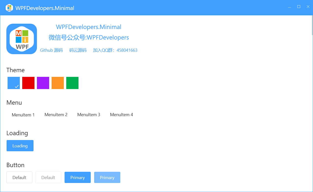
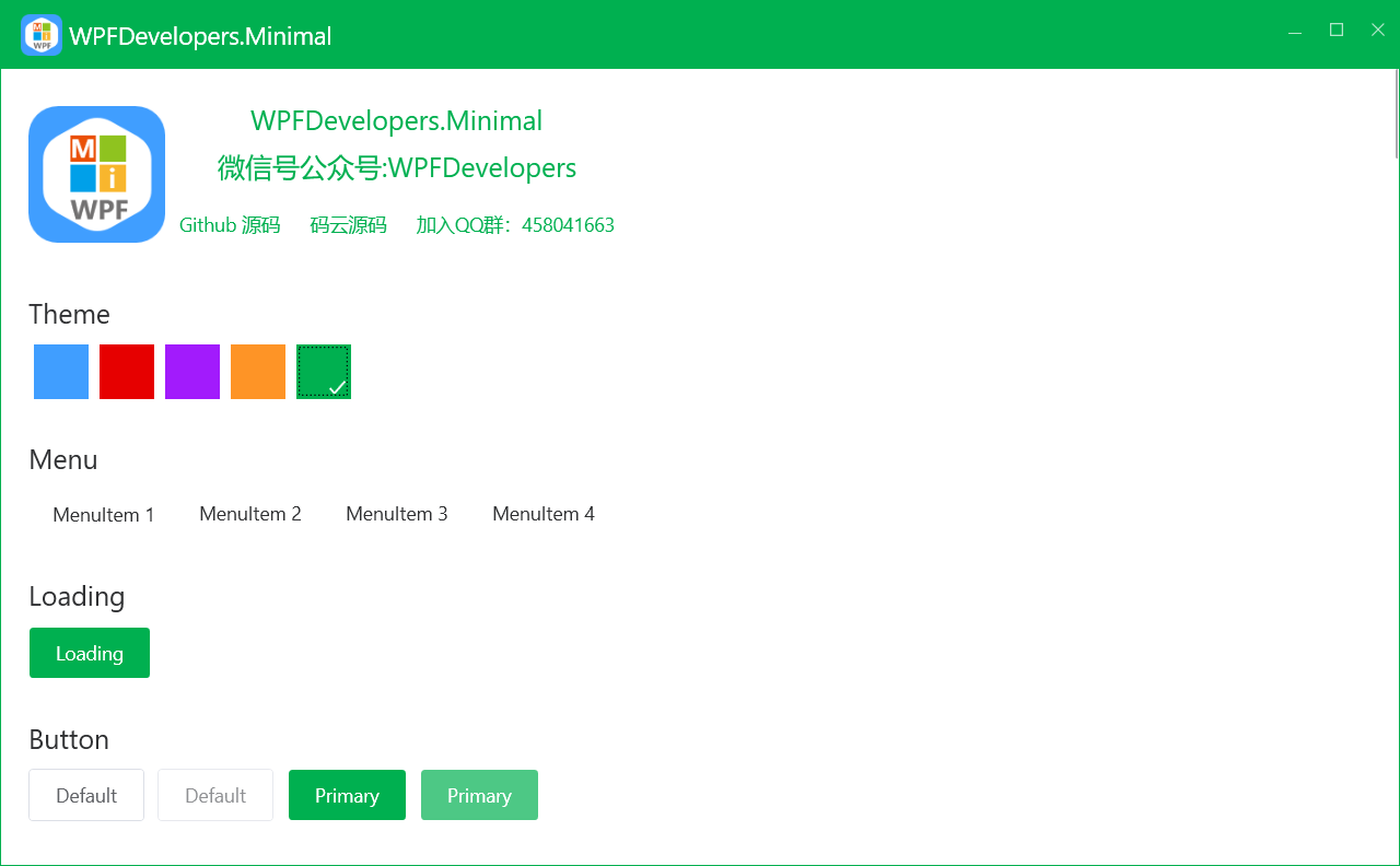
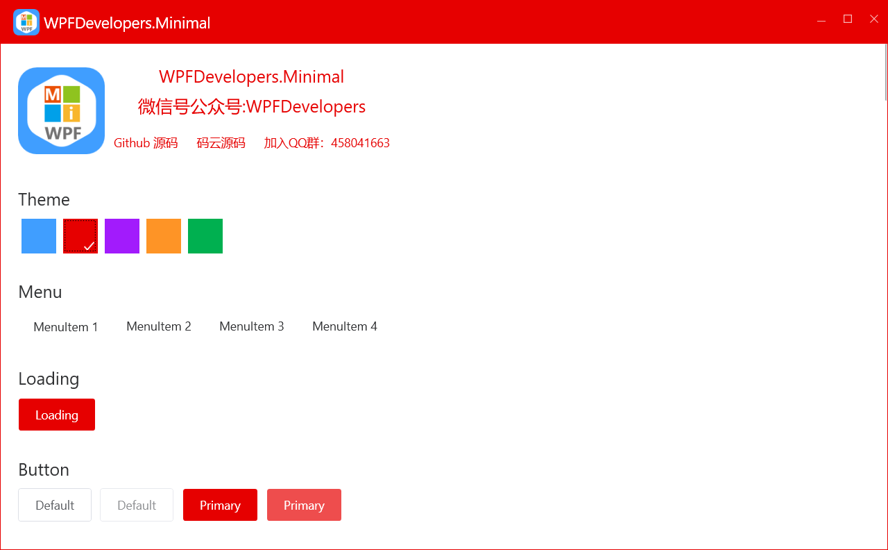
WPFDevelopers.Minimal
1.0.0.3-preview1
dotnet add package WPFDevelopers.Minimal --version 1.0.0.3-preview1
NuGet\Install-Package WPFDevelopers.Minimal -Version 1.0.0.3-preview1
<PackageReference Include="WPFDevelopers.Minimal" Version="1.0.0.3-preview1" />
paket add WPFDevelopers.Minimal --version 1.0.0.3-preview1
#r "nuget: WPFDevelopers.Minimal, 1.0.0.3-preview1"
// Install WPFDevelopers.Minimal as a Cake Addin
#addin nuget:?package=WPFDevelopers.Minimal&version=1.0.0.3-preview1&prerelease

// Install WPFDevelopers.Minimal as a Cake Tool
#tool nuget:?package=WPFDevelopers.Minimal&version=1.0.0.3-preview1&prerelease
<div align="center"><img src="https://github.com/WPFDevelopersOrg/WPFDevelopers.Minimal/raw/main/src/WPFDevelopers.Minimal/WPFDevelopers.Minimal.Sample.Net40/Resources/WPFDevelopers.Minimal.png"/></div>
Welcome to WPFDevelopers.Minimal

Stop updating, not recommended. Please skip to the custom library
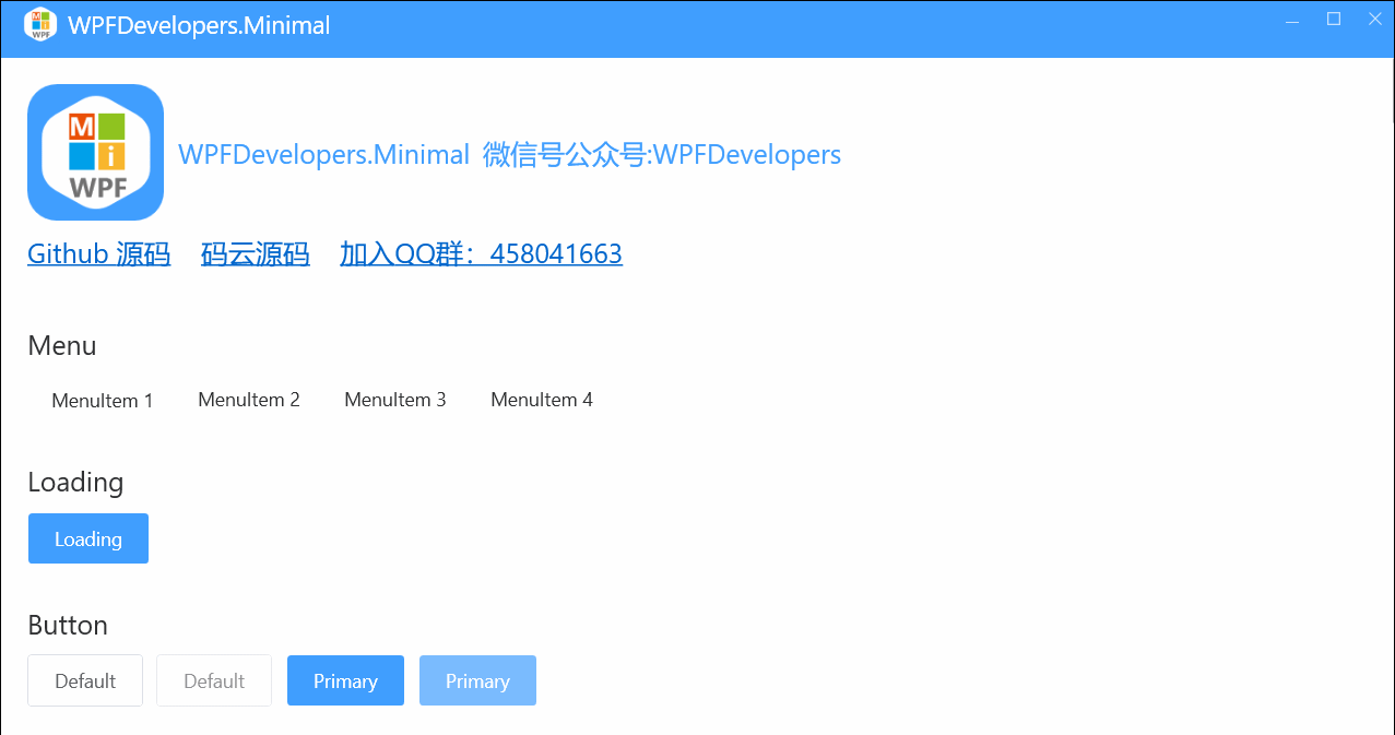
自定义高级控件 https://github.com/WPFDevelopersOrg/WPFDevelopers
码云 https://gitee.com/WPFDevelopersOrg
加入QQ群:458041663
欢迎关注微信公众号
<img src="https://github.com/WPFDevelopersOrg/ResourcesCache/raw/main/resources/wxgzh.jpg"/>
捐助
如果您觉得我们的开源软件对你有所帮助,请扫下方二维码打赏我们一杯咖啡。 | 支付宝 | 微信 | |----|-----| | <img src="https://github.com/WPFDevelopersOrg/ResourcesCache/raw/main/resources/Alipay.png"/> | <img src="https://github.com/WPFDevelopersOrg/ResourcesCache/raw/main/resources/WeChatPay.png"/> |
Contributor
<a href="https://github.com/yanjinhuagood" target="_blank"><img style="border-radius:50%!important" width="64px" alt="ChisterWu" src="https://avatars.githubusercontent.com/u/23089734?v=4"></a> <a href="https://github.com/ChisterWu" target="_blank"><img style="border-radius:50%!important" width="64px" alt="ChisterWu" src="https://avatars.githubusercontent.com/u/28770378?v=4"></a>
.Net Version
| .Net Version | Status |
|---|---|
| Net40 | ✅ |
| net45 | ✅ |
| net46 | ✅ |
| net47 | ✅ |
| net48 | ✅ |
| netcoreapp3.0 | ✅ |
| net5.0-windows | ✅ |
| net6.0-windows | ✅ |
Please use the preview Nuget package for the latest
Preview
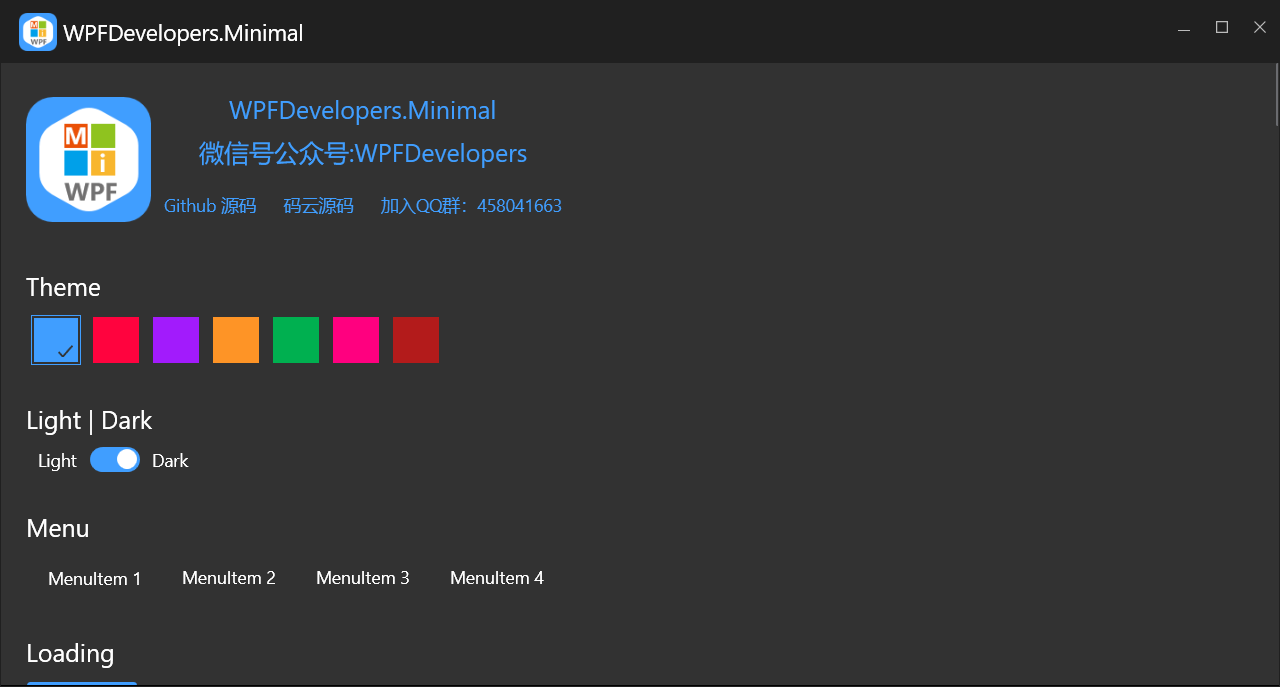
Nuget Version >= 3.2.3 Preview Theme
Step 1: add nuget;
Install-Package WPFDevelopers.Minimal
Step 2: App. Add node in Xaml;
       注意:从旧版升级报错时请把 xmlns:ws="https://github.com/WPFDevelopersOrg.WPFDevelopers.Minimal"
       改成xmlns:ws="https://github.com/WPFDevelopersOrg/WPFDevelopers.Minimal"
    xmlns:ws="https://github.com/WPFDevelopersOrg/WPFDevelopers.Minimal"
    <Application.Resources>
        <ResourceDictionary>
            <ResourceDictionary.MergedDictionaries>
                <ResourceDictionary Source="pack://application:,,,/WPFDevelopers.Minimal;component/Themes/Light.Blue.xaml"/>

                <ws:Resources Theme="Light"/>
                <ResourceDictionary Source="pack://application:,,,/WPFDevelopers.Minimal;component/Themes/Theme.xaml"/>
            </ResourceDictionary.MergedDictionaries>
        </ResourceDictionary>
    </Application.Resources>
Step 3: add namespace;
xmlns:ws="https://github.com/WPFDevelopersOrg/WPFDevelopers.Minimal"
DataSource
NotifyIcon
Window
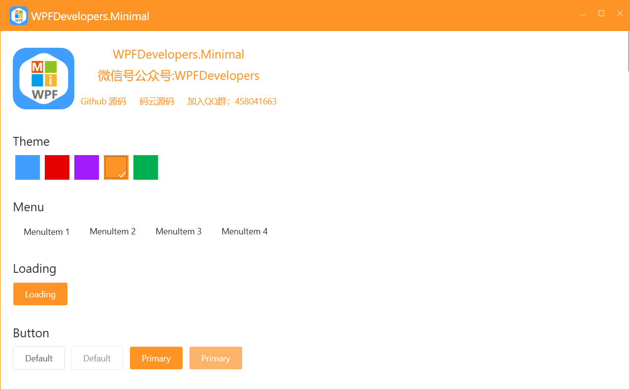
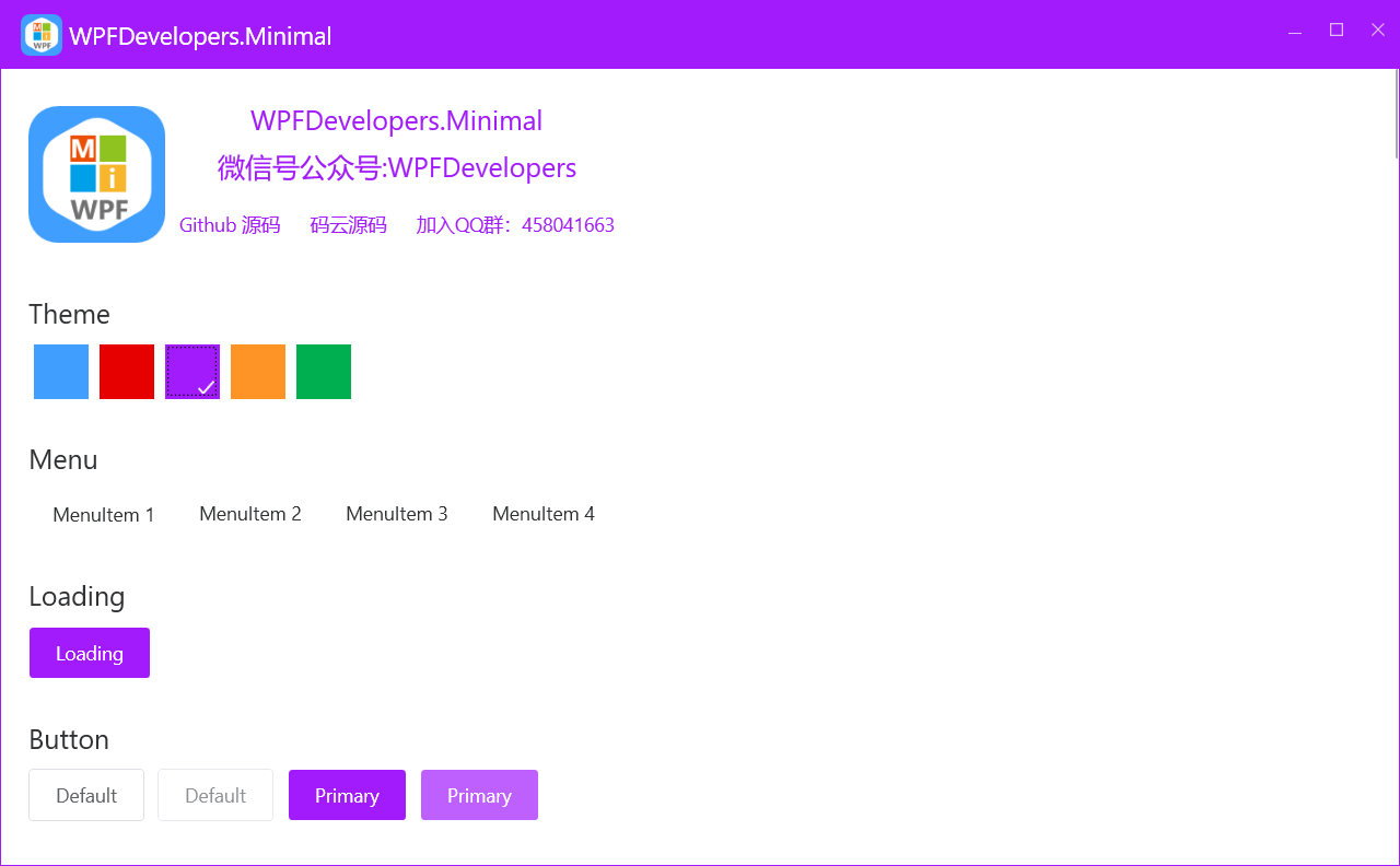
Loading
MessageBox
Menu|ContextMenu
Button
RadioButton
Checkbox
TextBox
PasswordBox
ComboBox
ToggleButton
DatePicker
Slider
ProgressBar
DataGrid
ListBox
ListView
TreeView
Expander
GroupBox
TabControl
GridSplitter
<a id="DataSource ">DataSource </a>
1).cs
using System;
using System.Collections.ObjectModel;
using System.Linq;
using System.Windows;
using WPFDevelopers.Minimal.Sample.Models;

namespace WPFDevelopers.Minimal.Sample.ExampleViews
{
    public partial class MainView : WPFDevelopers.Minimal.Net40.Window
    {
        #region DataSource
        public ObservableCollection<UserModel> UserCollection
        {
            get { return (ObservableCollection<UserModel>)GetValue(UserCollectionProperty); }
            set { SetValue(UserCollectionProperty, value); }
        }

        public static readonly DependencyProperty UserCollectionProperty =
            DependencyProperty.Register("UserCollection", typeof(ObservableCollection<UserModel>), typeof(MainView), new PropertyMetadata(null));


        public bool AllSelected
        {
            get { return (bool)GetValue(AllSelectedProperty); }
            set { SetValue(AllSelectedProperty, value); }
        }

        public static readonly DependencyProperty AllSelectedProperty =
            DependencyProperty.Register("AllSelected", typeof(bool), typeof(MainView), new PropertyMetadata(AllSelectedChangedCallback));

        private static void AllSelectedChangedCallback(DependencyObject d, DependencyPropertyChangedEventArgs e)
        {
            var view = d as MainView;
            var isChecked = (bool)e.NewValue;
            if ((bool)e.NewValue)
                view.UserCollection.ToList().ForEach(y => y.IsChecked = isChecked);
            else
                view.UserCollection.ToList().ForEach(y => y.IsChecked = isChecked);
        }

        #endregion

        public MainView()
        {
            InitializeComponent();
            this.Loaded += MainView_Loaded;
        }

        private void MainView_Loaded(object sender, RoutedEventArgs e)
        {
            var time = DateTime.Now;
            UserCollection = new ObservableCollection<UserModel>();
            for (int i = 0; i < 4; i++)
            {
                UserCollection.Add(new UserModel
                {
                    Date = time,
                    Name = "WPFDevelopers",
                    Address = "No. 189, Grove St, Los Angeles",
                    Children = new System.Collections.Generic.List<UserModel>()
                    {
                         new UserModel { Name= "WPFDevelopers.Minimal1.1" },
                         new UserModel { Name = "WPFDevelopers.Minimal1.2" },
                         new UserModel { Name = "WPFDevelopers.Minimal1.3" },
                          new UserModel { Name= "WPFDevelopers.Minimal1.4" },
                         new UserModel { Name = "WPFDevelopers.Minimal1.5" },
                         new UserModel { Name = "WPFDevelopers.Minimal1.6" },
                    }
                });
                time = time.AddDays(2);
            }
        }
    }
}
<a id="NotifyIcon">NotifyIcon</a>
1)XAML
 <ws:NotifyIcon Title="WPF开发者" Name="WpfNotifyIcon">
                <ws:NotifyIcon.ContextMenu>
                    <ContextMenu>
                        <MenuItem Header="托盘消息" Click="SendMessage_Click"/>
                        <MenuItem Header="闪烁" Name="menuItemTwink"  Click="Twink_Click"/>
                        <MenuItem Header="关于" Click="About_Click">
                            <MenuItem.Icon>
                                <Path Data="{StaticResource PathWarning}"
                                      Fill="{DynamicResource PrimaryNormalSolidColorBrush}"
                                      Stretch="Uniform" Height="20" Width="20"/>
                            </MenuItem.Icon>
                        </MenuItem>
                        <MenuItem Header="退出" Click="Quit_Click"/>
                    </ContextMenu>
                </ws:NotifyIcon.ContextMenu>
            </ws:NotifyIcon>
2)CS code
private void Quit_Click(object sender, RoutedEventArgs e)
        {
            Application.Current.Shutdown();
        }

        private void About_Click(object sender, RoutedEventArgs e)
        {
            new AboutWindow().Show();
        }

        private void SendMessage_Click(object sender, RoutedEventArgs e)
        {
            NotifyIcon.ShowBalloonTip("Message", " Welcome to WPFDevelopers.Minimal ",NotifyIconInfoType.None);
        }

        private void Twink_Click(object sender, RoutedEventArgs e)
        {
            WpfNotifyIcon.IsTwink = !WpfNotifyIcon.IsTwink;
            menuItemTwink.IsChecked = WpfNotifyIcon.IsTwink;
        }
<a id="Window">Window</a>
1)XAML
ws:Window x:Class="WpfApp.MainWindow"
2)remove. Inheritance in CS file
public partial class MainWindow

<a id="Loading">Loading</a>
1).cs
var task = new Task(() =>
{
   //Things to wait for
   Thread.Sleep(5000);
});
task.ContinueWith((previousTask) =>
{
   WPFDevelopers.Minimal.Controls.Loading.Close();
},TaskScheduler.FromCurrentSynchronizationContext());
WPFDevelopers.Minimal.Controls.Loading.Show();
task.Start();
2)Exit Task
var tokenSource = new CancellationTokenSource();
var cancellationToken = tokenSource.Token;
var task = new Task(() =>
{
  for (int i = 0; i < 5; i++)
  {
   //这里做自己的事情
    if (tokenSource.IsCancellationRequested)return;
    Thread.Sleep(1000);
  }
 }, cancellationToken);
 task.ContinueWith(previousTask =>
 {
   if (tokenSource.IsCancellationRequested)return;
  Loading.Close();
 }, TaskScheduler.FromCurrentSynchronizationContext());
 Loading.Show(true);
 Loading.LoadingQuitEvent += delegate
 {
   tokenSource.Cancel();
 };
task.Start();
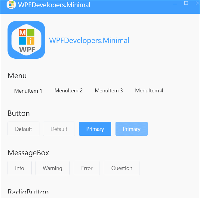
<a id="MessageBox">MessageBox</a>
1).cs
WPFDevelopers.Minimal.Controls.MessageBox.Show("文件删除成功。", "消息",MessageBoxButton.OK,MessageBoxImage.Information);
WPFDevelopers.Minimal.Controls.MessageBox.Show("当前文件不存在!", "警告", MessageBoxImage.Warning);
WPFDevelopers.Minimal.Controls.MessageBox.Show("当前文件不存在。", "错误", MessageBoxImage.Error);
WPFDevelopers.Minimal.Controls.MessageBox.Show("当前文件不存在,是否继续?", "询问", MessageBoxButton.OKCancel, MessageBoxImage.Question);
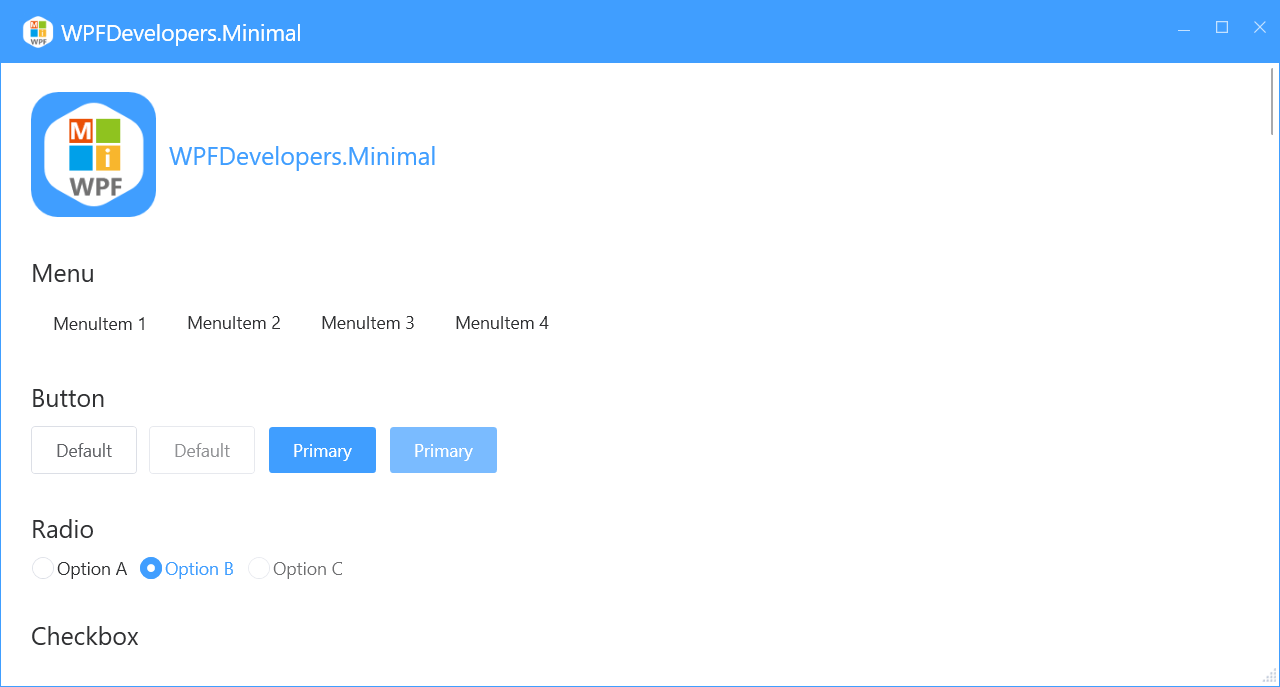
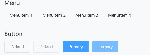
<a id="Menu|ContextMenu">Menu|ContextMenu</a>
1)XAML
 <WrapPanel Margin="0,10">
                    <WrapPanel.ContextMenu>
                        <ContextMenu>
                            <MenuItem Header="1323"/>
                        </ContextMenu>
                    </WrapPanel.ContextMenu>
                    <Menu>
                        <MenuItem Header="MenuItem 1">
                            <MenuItem Header="MenuItem 1.1">
                                <MenuItem Header="MenuItem 1.1.1"/>
                                <MenuItem Header="MenuItem 1.1.2"/>
                            </MenuItem>
                            <Separator/>
                            <MenuItem Header="MenuItem 1.2"/>
                            <MenuItem Header="MenuItem 1.3"/>
                            <MenuItem Header="MenuItem 1.4"/>
                            <MenuItem Header="MenuItem 1.5"/>
                        </MenuItem>
                        <MenuItem Header="MenuItem 2"/>
                        <MenuItem Header="MenuItem 3"/>
                        <MenuItem Header="MenuItem 4"/>
                    </Menu>
</WrapPanel>
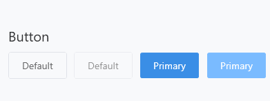
<a id="Button">Button</a>
1)XAML
 <WrapPanel Margin="0,10">
                    <Button Content="Default"/>
                    <Button Content="Default" Margin="10,0" IsEnabled="False"/>
                    <Button Content="Primary" Style="{StaticResource PrimaryButton}"/>
                    <Button Content="Primary" Style="{StaticResource PrimaryButton}" Margin="10,0" IsEnabled="False"/>
 </WrapPanel>
<a id="RadioButton">RadioButton</a>
1)XAML
 <WrapPanel Margin="0,10">
                   <RadioButton Content="Option A"/>
                    <RadioButton Content="Option B" Margin="10,0" IsChecked="True"/>
                    <RadioButton Content="Option C" IsEnabled="False"/>
 </WrapPanel>

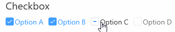
<a id="Checkbox">Checkbox</a>
1)XAML
 <WrapPanel Margin="0,10">
                 <CheckBox Content="Option A"/>
                 <CheckBox Content="Option B" Margin="10,0" IsChecked="True"/>
                 <CheckBox Content="Option C" IsChecked="{x:Null}"/>
                 <CheckBox Content="Option D" Margin="10,0" IsEnabled="False"/>
 </WrapPanel>
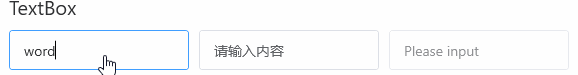
<a id="TextBox">TextBox</a>
1)XAML
 <WrapPanel Margin="0,10">
                  <TextBox/>
                    <TextBox Margin="10,0" ws:ElementHelper.Watermark="请输入内容"/>
                    <TextBox IsEnabled="False"/>
 </WrapPanel>
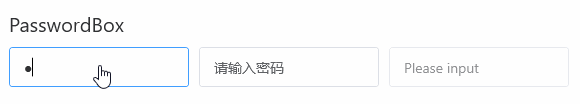
<a id="PasswordBox">PasswordBox</a>
1)XAML
 <WrapPanel Margin="0,10">
                <PasswordBox />
                    <PasswordBox Margin="10,0" ws:ElementHelper.Watermark="请输入密码"/>
                    <PasswordBox IsEnabled="False"/>

                     <PasswordBox Margin="10,0" ws:ElementHelper.Watermark="请输入密码"
                     ws:PasswordBoxHelper.IsMonitoring="True"/>

                     <PasswordBox ws:PasswordBoxHelper.IsMonitoring="True"
                         ws:ElementHelper.Watermark="请输入密码"
                         helpers:PasswordBoxHelper.Attach="True"
                         helpers:PasswordBoxHelper.Password="{Binding Path=Account.PassWord,Mode=TwoWay,UpdateSourceTrigger=PropertyChanged}" Margin="0,10"/>
 </WrapPanel>
<a id="ComboBox">ComboBox</a>
1)XAML
 <WrapPanel Margin="0,10">
              <ComboBox Width="200">
                        <ComboBoxItem>Option 1</ComboBoxItem>
                        <ComboBoxItem>Option 2</ComboBoxItem>
                        <ComboBoxItem>Option 3</ComboBoxItem>
                        <ComboBoxItem>Option 4</ComboBoxItem>
                        <ComboBoxItem>Option 5</ComboBoxItem>
                    </ComboBox>
 </WrapPanel>
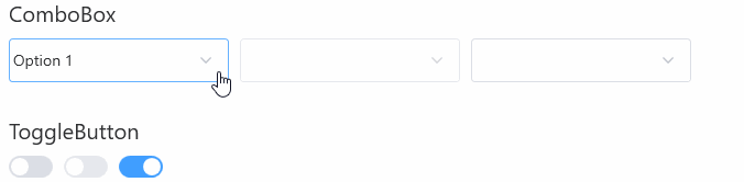
<a id="ToggleButton">ToggleButton</a>
1)XAML
 <WrapPanel Margin="0,10">
           <ToggleButton/>
                    <ToggleButton Margin="10,0" IsEnabled="False"/>
                    <ToggleButton IsChecked="True"/>
 </WrapPanel>

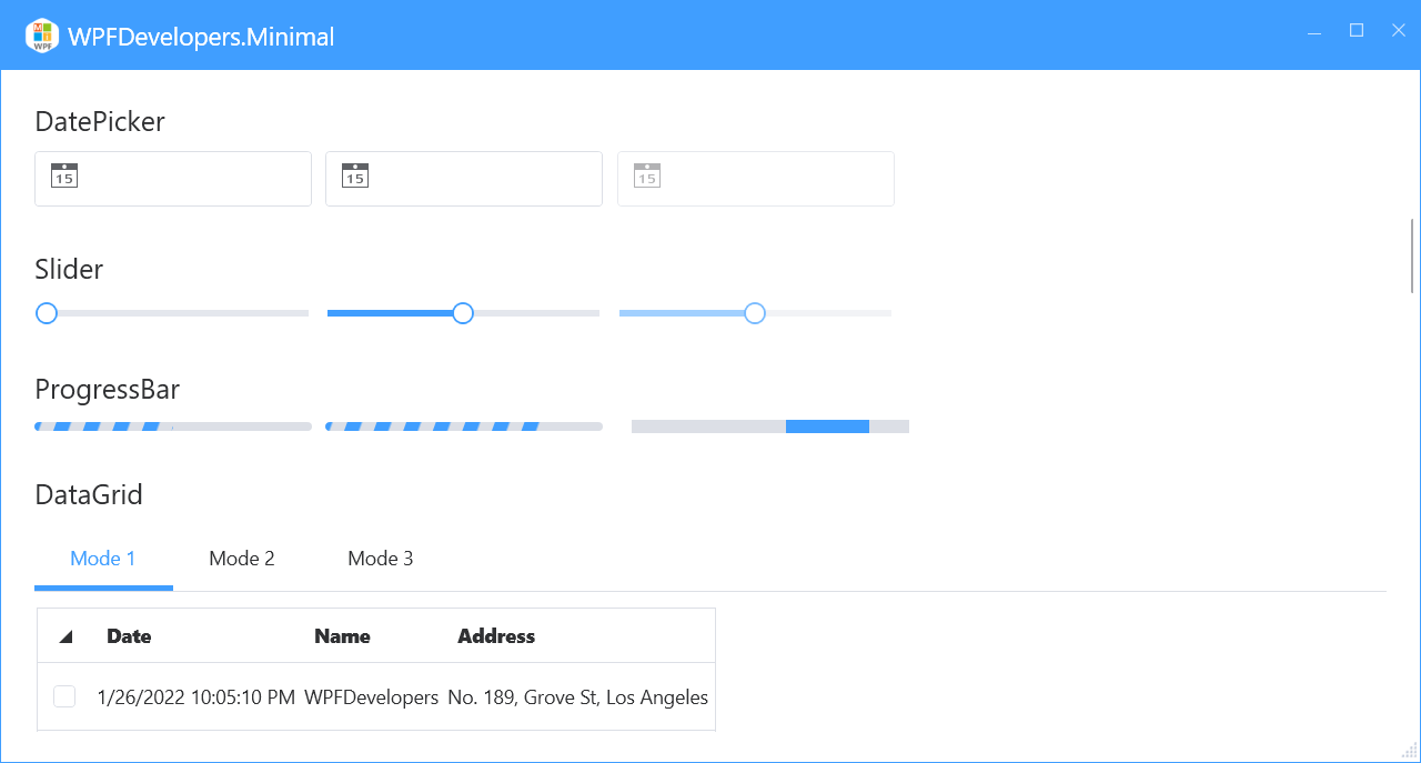
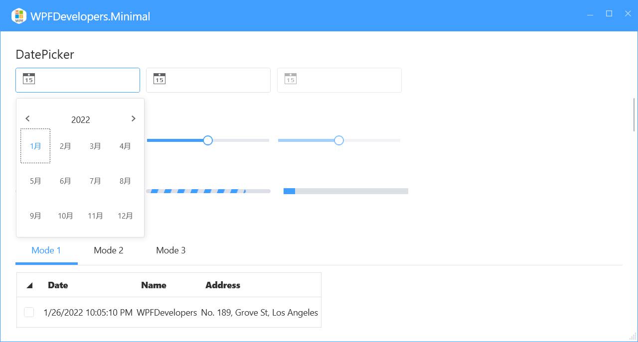
<a id="DatePicker">DatePicker</a>
1)XAML
 <WrapPanel Margin="0,10">
           <DatePicker Width="200"/>
                    <DatePicker Width="200" SelectedDateFormat="Long" Margin="10,0"/>
                    <DatePicker Width="200" IsEnabled="False"/>
 </WrapPanel>
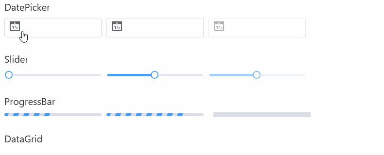
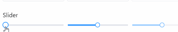
<a id="Slider">Slider</a>
1)XAML
 <WrapPanel Margin="0,10">
           <Slider Width="200"/>
                    <Slider Width="200" Value="50" Maximum="100"  Margin="10,0"/>
                    <Slider Width="200" Value="50" Maximum="100" IsEnabled="False"/>
 </WrapPanel>
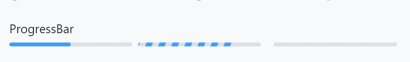
<a id="ProgressBar">ProgressBar</a>
1)XAML
 <WrapPanel Margin="0,10">
         <ProgressBar Width="200" Value="50" />
                    <ProgressBar Width="200" Margin="10,0"  Value="80" ws:ElementHelper.IsStripe="True"/>
                    <ProgressBar Width="200" Margin="10,0" IsIndeterminate="True" Value="10"/>
 </WrapPanel>
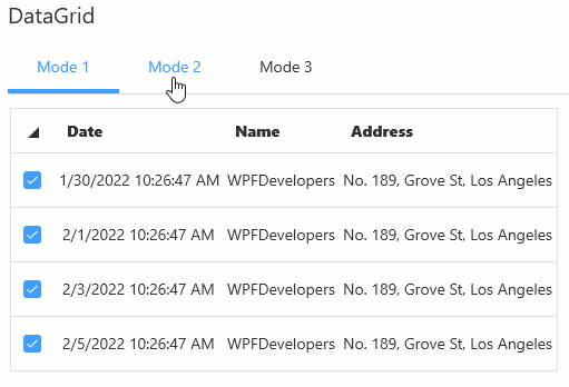
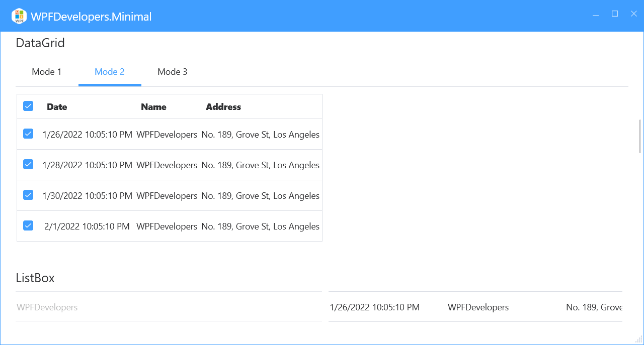
<a id="DataGrid">DataGrid</a>
1)XAML Mode 1
 <WrapPanel Margin="0,10">
          <DataGrid AutoGenerateColumns="False" HeadersVisibility="All" RowHeaderWidth="40"
                                  ItemsSource="{Binding UserCollection,RelativeSource={RelativeSource AncestorType=local:MainView}}"
                                  Margin="0,10">
                            <DataGrid.RowHeaderTemplate>
                                <DataTemplate>
                                    <CheckBox IsChecked="{Binding IsSelected,RelativeSource={RelativeSource AncestorType=DataGridRow}}"/>
                                </DataTemplate>
                            </DataGrid.RowHeaderTemplate>
                            <DataGrid.Columns>
                                <DataGridTextColumn Header="Date" Binding="{Binding Date}" IsReadOnly="True"/>
                                <DataGridTextColumn Header="Name" Binding="{Binding Name}" IsReadOnly="True"/>
                                <DataGridTextColumn Header="Address" Binding="{Binding Address}" IsReadOnly="True"/>
                            </DataGrid.Columns>
                        </DataGrid>
 </WrapPanel>
2)XAML Mode 2
 <WrapPanel Margin="0,10">
        <DataGrid AutoGenerateColumns="False"
                                  ItemsSource="{Binding UserCollection,RelativeSource={RelativeSource AncestorType=local:MainView}}"
                                  Margin="0,10">
                            <DataGrid.Columns>
                                <DataGridTemplateColumn CanUserResize="False">
                                <DataGridTemplateColumn.HeaderTemplate>
                                    <DataTemplate>
                                        <CheckBox IsChecked="{Binding RelativeSource={RelativeSource Mode=FindAncestor, AncestorType=local:MainView}, Path=AllSelected}" />
                                    </DataTemplate>
                                </DataGridTemplateColumn.HeaderTemplate>
                                <DataGridTemplateColumn.CellTemplate>
                                    <DataTemplate>
                                        <CheckBox Margin="10,0,0,0" IsChecked="{Binding IsChecked}"/>
                                    </DataTemplate>
                                </DataGridTemplateColumn.CellTemplate>
                            </DataGridTemplateColumn>
                                <DataGridTextColumn Header="Date" Binding="{Binding Date}" IsReadOnly="True"/>
                                <DataGridTextColumn Header="Name" Binding="{Binding Name}" IsReadOnly="True"/>
                                <DataGridTextColumn Header="Address" Binding="{Binding Address}" IsReadOnly="True"/>
                            </DataGrid.Columns>
                        </DataGrid>
 </WrapPanel>
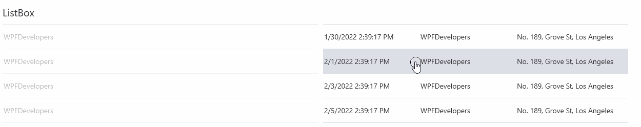
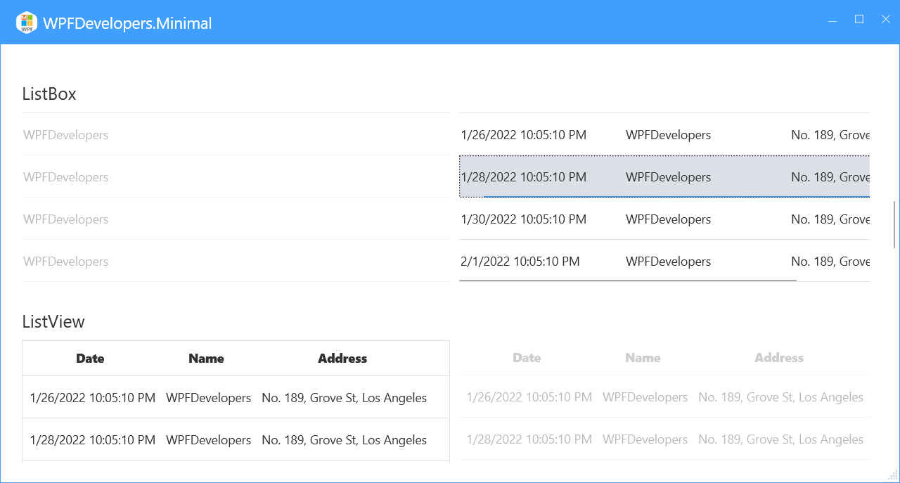
<a id="ListBox">ListBox</a>
1)XAML
 <WrapPanel Margin="0,10">
        <ListBox DisplayMemberPath="Name" IsEnabled="False"
                        ItemsSource="{Binding UserCollection,RelativeSource={RelativeSource AncestorType=local:MainView}}">
                    </ListBox>
                    <ListBox  Margin="10,0"
                             ItemsSource="{Binding UserCollection,RelativeSource={RelativeSource AncestorType=local:MainView}}">
                        <ListBox.ItemTemplate>
                            <DataTemplate>
                                <UniformGrid Columns="3">
                                    <TextBlock Text="{Binding Date}"/>
                                    <TextBlock Text="{Binding Name}"/>
                                    <TextBlock Text="{Binding Address}"/>
                                </UniformGrid>
                            </DataTemplate>
                        </ListBox.ItemTemplate>
                    </ListBox>
 </WrapPanel>
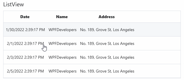
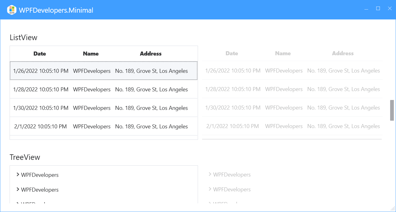
<a id="ListView">ListView</a>
1)XAML
 <WrapPanel Margin="0,10">
       <ListView ItemsSource="{Binding UserCollection,RelativeSource={RelativeSource AncestorType=local:MainView}}">
                        <ListView.View>
                            <GridView>
                                <GridViewColumn Header="Date" DisplayMemberBinding="{Binding Date}" />
                                <GridViewColumn Header="Name" DisplayMemberBinding="{Binding Name}" />
                                <GridViewColumn Header="Address" DisplayMemberBinding="{Binding Address}" Width="Auto"/>
                            </GridView>
                        </ListView.View>
                    </ListView>
                    <ListView IsEnabled="False" Margin="10,0" BorderThickness="0"
                              ItemsSource="{Binding UserCollection,RelativeSource={RelativeSource AncestorType=local:MainView}}">
                        <ListView.View>
                            <GridView>
                                <GridViewColumn Header="Date" DisplayMemberBinding="{Binding Date}" />
                                <GridViewColumn Header="Name" DisplayMemberBinding="{Binding Name}" />
                                <GridViewColumn Header="Address" DisplayMemberBinding="{Binding Address}" Width="Auto"/>
                            </GridView>
                        </ListView.View>
                    </ListView>
 </WrapPanel>
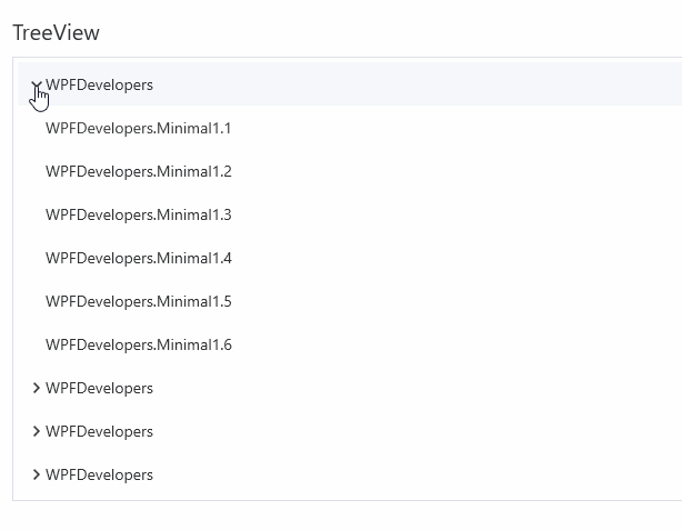
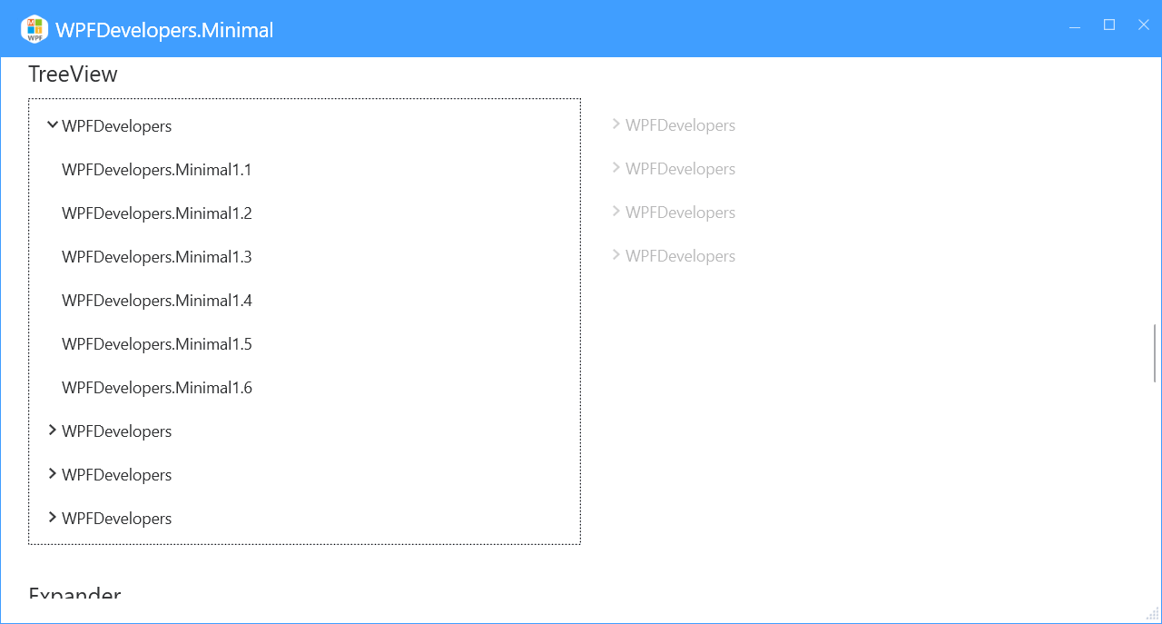
<a id="TreeView">TreeView</a>
1)XAML
 <WrapPanel Margin="0,10">
       <TreeView ItemsSource="{Binding UserCollection,RelativeSource={RelativeSource AncestorType=local:MainView}}">
                        <TreeView.ItemTemplate>
                            <HierarchicalDataTemplate ItemsSource="{Binding Children}">
                                <Border>
                                    <TextBlock Text="{Binding Path=Name}"/>
                                </Border>
                            </HierarchicalDataTemplate>
                        </TreeView.ItemTemplate>
                    </TreeView>
                    <TreeView IsEnabled="False" Margin="10,0" BorderThickness="0"
                              ItemsSource="{Binding UserCollection,RelativeSource={RelativeSource AncestorType=local:MainView}}">
                        <TreeView.ItemTemplate>
                            <HierarchicalDataTemplate ItemsSource="{Binding Children}">
                                <Border>
                                    <TextBlock Text="{Binding Path=Name}"/>
                                </Border>
                            </HierarchicalDataTemplate>
                        </TreeView.ItemTemplate>
                    </TreeView>
 </WrapPanel>
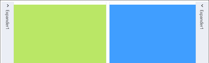
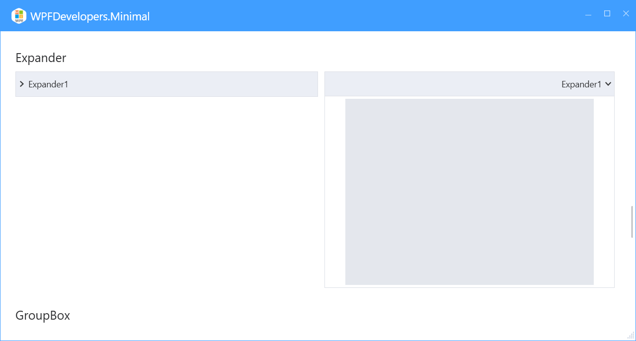
<a id="Expander">Expander</a>
1)XAML
  <UniformGrid Margin="0,10" Columns="2">
                    <Expander Header="Expander1">
                        <Rectangle Fill="{DynamicResource DangerSolidColorBrush}"
                                   Width="400" Height="300"/>
                    </Expander>
                    <Expander Header="Expander1" ExpandDirection="Up" Margin="10,0" FlowDirection="RightToLeft" IsExpanded="True">
                        <Rectangle Fill="{DynamicResource LightSolidColorBrush}"
                                   Width="400" Height="300"/>
                    </Expander>
                    <Expander ExpandDirection="Right" Margin="0,10">
                        <Expander.Header>
                            <TextBlock Text="Expander1">
                                <TextBlock.LayoutTransform>
                                    <RotateTransform Angle="90"/>
                                </TextBlock.LayoutTransform>
                            </TextBlock>
                        </Expander.Header>
                        <Rectangle Fill="{DynamicResource CircularSingularSolidColorBrush}"
                                   Width="400" Height="300"/>
                    </Expander>
                    <Expander ExpandDirection="Left" Margin="10" IsExpanded="True">
                        <Expander.Header>
                            <TextBlock Text="Expander1">
                                <TextBlock.LayoutTransform>
                                    <RotateTransform Angle="90"/>
                                </TextBlock.LayoutTransform>
                            </TextBlock>
                        </Expander.Header>
                        <Rectangle Fill="{DynamicResource PrimaryNormalSolidColorBrush}"
                                   Width="400" Height="300"/>
                    </Expander>
                </UniformGrid>
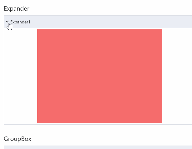
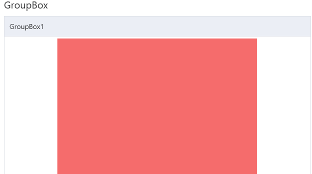
<a id="GroupBox">GroupBox</a>
1)XAML
 <WrapPanel Margin="0,10">
      <GroupBox Header="GroupBox1">
                        <Rectangle Fill="{DynamicResource DangerSolidColorBrush}"
                                   Width="400" Height="300"/>
                    </GroupBox>
                    <GroupBox Header="GroupBox1" Margin="10,0" IsEnabled="False">
                        <Rectangle Fill="{DynamicResource LightSolidColorBrush}"
                                   Width="400" Height="300"/>
                    </GroupBox>
 </WrapPanel>
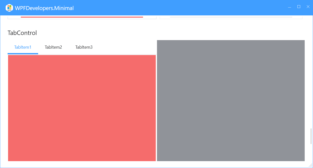
<a id="TabControl">TabControl</a>
1)XAML
<UniformGrid Columns="2" Rows="2" Margin="0,10">
<UniformGrid.Resources>
<Style TargetType="{x:Type Rectangle}">
<Setter Property="Width" Value="{x:Static SystemParameters.PrimaryScreenWidth}"/>
<Setter Property="Height" Value="400"/>
</Style>
</UniformGrid.Resources>
<TabControl>
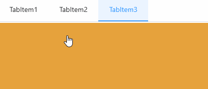
<TabItem Header="TabItem1">
<Rectangle Fill="{DynamicResource DangerSolidColorBrush}"/>
</TabItem>
<TabItem Header="TabItem2">
<Rectangle Fill="{DynamicResource InfoSolidColorBrush}"/>
</TabItem>
<TabItem Header="TabItem3" >
<Rectangle Fill="{DynamicResource WarningSolidColorBrush}"/>
</TabItem>
</TabControl>
<TabControl TabStripPlacement="Bottom">
<TabItem Header="TabItem1">
<Rectangle Fill="{DynamicResource InfoSolidColorBrush}"/>
</TabItem>
<TabItem Header="TabItem2">
<Rectangle Fill="{DynamicResource DangerSolidColorBrush}"/>
</TabItem>
<TabItem Header="TabItem3" >
<Rectangle Fill="{DynamicResource WarningSolidColorBrush}"/>
</TabItem>
</TabControl>
<TabControl TabStripPlacement="Left">
<TabItem Header="TabItem1">
<Rectangle Fill="{DynamicResource WarningSolidColorBrush}"/>
</TabItem>
<TabItem Header="TabItem2">
<Rectangle Fill="{DynamicResource InfoSolidColorBrush}"/>
</TabItem>
<TabItem Header="TabItem3" >
<Rectangle Fill="{DynamicResource DangerSolidColorBrush}"/>
</TabItem>
</TabControl>
<TabControl TabStripPlacement="Right" IsEnabled="False">
<TabItem Header="TabItem1">
<Rectangle Fill="{DynamicResource SuccessSolidColorBrush}"/>
</TabItem>
<TabItem Header="TabItem2">
<Rectangle Fill="{DynamicResource InfoSolidColorBrush}"/>
</TabItem>
<TabItem Header="TabItem3" >
<Rectangle Fill="{DynamicResource WarningSolidColorBrush}"/>
</TabItem>
</TabControl>
</UniformGrid>
<a id="GridSplitter">GridSplitter</a>
1)XAML
 <Grid Margin="0,10">
      <Grid.ColumnDefinitions>
            <ColumnDefinition/>
            <ColumnDefinition Width="Auto" />
            <ColumnDefinition/>
        </Grid.ColumnDefinitions>
         <Rectangle Fill="AliceBlue" Grid.Column="0"/>
          <GridSplitter Grid.Column="1"
              HorizontalAlignment="Center"
              VerticalAlignment="Stretch"
              ShowsPreview="True"
              Width="5"
              />
         <Rectangle Fill="Pink" Grid.Column="2"/>

 </Grid>

<a id="Blue">Blue</a>
<ResourceDictionary Source="pack://application:,,,/WPFDevelopers.Minimal;component/Themes/Light.Blue.xaml"/>
<a id="Green">Green</a>
<ResourceDictionary Source="pack://application:,,,/WPFDevelopers.Minimal;component/Themes/Light.Green.xaml"/>
<a id="Red">Red</a>
<ResourceDictionary Source="pack://application:,,,/WPFDevelopers.Minimal;component/Themes/Light.Red.xaml"/>
<a id="Orange">Orange</a>
<ResourceDictionary Source="pack://application:,,,/WPFDevelopers.Minimal;component/Themes/Light.Orange.xaml"/>
<a id="Purple">Purple</a>
<ResourceDictionary Source="pack://application:,,,/WPFDevelopers.Minimal;component/Themes/Light.Purple.xaml"/>
| Product | Versions Compatible and additional computed target framework versions. |
|---|---|
| .NET | net5.0 is compatible. net5.0-windows was computed. net6.0 is compatible. net6.0-android was computed. net6.0-ios was computed. net6.0-maccatalyst was computed. net6.0-macos was computed. net6.0-tvos was computed. net6.0-windows was computed. net7.0 is compatible. net7.0-android was computed. net7.0-ios was computed. net7.0-maccatalyst was computed. net7.0-macos was computed. net7.0-tvos was computed. net7.0-windows was computed. net8.0 is compatible. net8.0-android was computed. net8.0-browser was computed. net8.0-ios was computed. net8.0-maccatalyst was computed. net8.0-macos was computed. net8.0-tvos was computed. net8.0-windows was computed. |
| .NET Core | netcoreapp3.0 is compatible. netcoreapp3.1 was computed. |
| .NET Framework | net40 is compatible. net403 was computed. net45 is compatible. net451 was computed. net452 was computed. net46 is compatible. net461 was computed. net462 was computed. net463 was computed. net47 is compatible. net471 was computed. net472 was computed. net48 is compatible. net481 was computed. |
-
.NETCoreApp 3.0
- No dependencies.
-
.NETFramework 4.0
- No dependencies.
-
.NETFramework 4.5
- No dependencies.
-
.NETFramework 4.6
- No dependencies.
-
.NETFramework 4.7
- No dependencies.
-
.NETFramework 4.8
- No dependencies.
-
net5.0
- No dependencies.
-
net6.0
- No dependencies.
-
net7.0
- No dependencies.
-
net8.0
- No dependencies.
NuGet packages
This package is not used by any NuGet packages.
GitHub repositories (1)
Showing the top 1 popular GitHub repositories that depend on WPFDevelopers.Minimal:
| Repository | Stars |
|---|---|
|
WPFDevelopersOrg/WPFDevelopers.Minimal
This is a WPF basic control, welcome to use 😊
|
| Version | Downloads | Last updated |
|---|---|---|
| 1.0.0.3-preview1 | 71 | 2/19/2024 |
| 1.0.0.3-preview | 798 | 2/5/2023 |
| 1.0.0.2-preview | 136 | 1/9/2023 |
| 1.0.0.1-preview | 224 | 12/5/2022 |