Iciclecreek.Avalonia.Controls.Media
1.0.5
dotnet add package Iciclecreek.Avalonia.Controls.Media --version 1.0.5
NuGet\Install-Package Iciclecreek.Avalonia.Controls.Media -Version 1.0.5
<PackageReference Include="Iciclecreek.Avalonia.Controls.Media" Version="1.0.5" />
paket add Iciclecreek.Avalonia.Controls.Media --version 1.0.5
#r "nuget: Iciclecreek.Avalonia.Controls.Media, 1.0.5"
// Install Iciclecreek.Avalonia.Controls.Media as a Cake Addin
#addin nuget:?package=Iciclecreek.Avalonia.Controls.Media&version=1.0.5

// Install Iciclecreek.Avalonia.Controls.Media as a Cake Tool
#tool nuget:?package=Iciclecreek.Avalonia.Controls.Media&version=1.0.5
Iciclecreek.Avalonia.Controls.Media
This control library adds support for LibVLC MediaPlayer for Avalonia Desktop applications.
- MediaPlayerViewModel - A view model class which wraps MediaPlayer so that it's easy to bind UI controls to Commands and state.
- VideoView element - a element which playing videos and exposes MediaPlayerViewModel for controlling the video playback.
- MediaPlayerControls element - a off-the-shelf implementation of a UI to control playback of the video
- Play/Stop/Pause
- Mute
- Rate
- etc.
Installation
- Install the control nuget package into to your shared Avalonia project
- Iciclcreek.Avalonia.Controls.Media
- Install the video playback nuget packages into your Desktop project
- VideoLan.LibVLC.Mac
- VideoLAN.LibVLC.Windows
Add a namespace for the library to your .axaml files:
xmlns:media="using:Iciclecreek.Avalonia.Controls.Media"
Samples
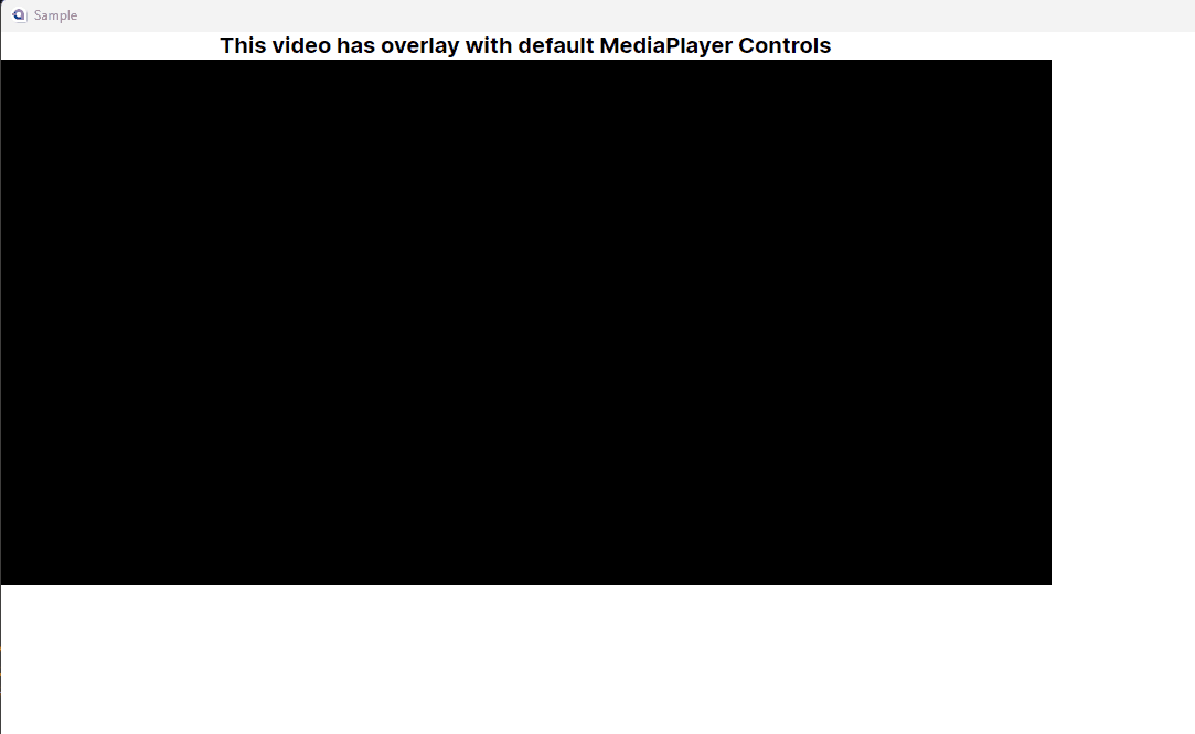
Overlay Controls Sample
<media:VideoView Source={Binding Url}>
   <media:MediaPlayerControls/>
</media:VideoView>
External Controls Sample
In this case a MediaPlayerControls element is external to the video player window (aka, not overlayed), but data bound to the MediaPlayerViewModel for the VideoView.
<media:VideoView Name="Player" Source={Binding Url} />

<media:MediaPlayerControls DataContext={Binding #Player.MediaPlayerViewModel}"/>
Custom binding sample
Here is an example which shows how you can create your own command bindings using the MediaPlayerViewModel
<media:VideoView Name="Player" Source={Binding Url} >
    <StackPanel Orientation="Horizontal" Background="Lavender">
        <Button Command="{Binding Play}">Play</Button>
        <Slider Value="{Binding Time}" Maximum="{Binding Length}" Width="200"/>
        <Button Command="{Binding Stop}">Stop</Button>
    </StackPanel>
</media:VideoView>
MediaPlayerViewModel class
The main class driving this is a view model which is set up to support Commands and Property notification to make it easy to data bind UI to the state of the MediaPlayer in the VideoView control. All of the Commands implement CanXXX() so that they are enabled/disabled automatically when bound as a Command.
| Command | Parameters | Description |
|---|---|---|
| Play | - | Play video |
| Stop | - | Stop Video - Play starts video over |
| Pause | - | Pause video - Play resumes |
| Mute | - | Mutes video |
| Unmute | - | Unmutes video |
| TogglePlayPause | - | Toggles Play/Pause for video |
| ToggleMute | - | Toggles Mute state |
| SetRate | float | Changes rate of playback (for example "1.75" ⇒ 1.75x faster than noraml) |
| Download | Open video external |
The MediaPlayerViewModel also exposes the state of the MediaPlayer so you can bind your UI to the properties and it will update in real time to changes (aka appropriate property notification).
| Property | Type | Description |
|---|---|---|
| IsMuted | bool | Mute state |
| IsCloseCaptioned | bool | Closed Caption state |
| Volume | int | volume for the video playback |
| IsSeekable | bool | Seekable state |
| Time | int | Current playback position in ms. Changing this changes playback position, so Slider control bound to this controls playback position of the video. |
| Length | int | Length of the video in ms. |
| Rate | float | Playback speed. |
VideoView element
This library contains a fork of the unofficial VideoView with overlay support. The changes are
- Adds a MediaPlayerViewModel property
- Sets DataContext for child overlay content to MediaPlayerViewModel
- Fixes overlay bugs on linux
- Fixes positioning bugs for overlay
- Cleaned up (removed static this pointers)
MediaPlayerControls Element
This is a prebuilt element which looks like this:

Supported Platforms
- Avalonia.Desktop
- Windows
- Linux
- MacOS
It has not been tested at all with Android/iOS
| Product | Versions Compatible and additional computed target framework versions. |
|---|---|
| .NET | net6.0 is compatible. net6.0-android was computed. net6.0-ios was computed. net6.0-maccatalyst was computed. net6.0-macos was computed. net6.0-tvos was computed. net6.0-windows was computed. net7.0 was computed. net7.0-android was computed. net7.0-ios was computed. net7.0-maccatalyst was computed. net7.0-macos was computed. net7.0-tvos was computed. net7.0-windows was computed. net8.0 was computed. net8.0-android was computed. net8.0-browser was computed. net8.0-ios was computed. net8.0-maccatalyst was computed. net8.0-macos was computed. net8.0-tvos was computed. net8.0-windows was computed. |
-
net6.0
- Avalonia (>= 11.0.5)
- Avalonia.ReactiveUI (>= 11.0.5)
- CSharpFunctionalExtensions (>= 2.40.3)
- FluentIcons.Avalonia (>= 1.1.223)
- LibVLCSharp (>= 3.8.2)
NuGet packages
This package is not used by any NuGet packages.
GitHub repositories
This package is not used by any popular GitHub repositories.