PSC.Blazor.Components.MarkdownEditor
2.0.9
See the version list below for details.
dotnet add package PSC.Blazor.Components.MarkdownEditor --version 2.0.9
NuGet\Install-Package PSC.Blazor.Components.MarkdownEditor -Version 2.0.9
<PackageReference Include="PSC.Blazor.Components.MarkdownEditor" Version="2.0.9" />
paket add PSC.Blazor.Components.MarkdownEditor --version 2.0.9
#r "nuget: PSC.Blazor.Components.MarkdownEditor, 2.0.9"
// Install PSC.Blazor.Components.MarkdownEditor as a Cake Addin
#addin nuget:?package=PSC.Blazor.Components.MarkdownEditor&version=2.0.9

// Install PSC.Blazor.Components.MarkdownEditor as a Cake Tool
#tool nuget:?package=PSC.Blazor.Components.MarkdownEditor&version=2.0.9
Blazor Markdown Editor
This is a Markdown Editor component for Blazor WebAssembly and Blazor Server with .NET6. The component is based on EasyMDE to create the editor and Markdig for rendering the Markdown text in HTML. For more documentation and help this component, visit the post I created here.

Try Markdown Editor online (upload is not enabled)
Usage
Add the Editor to your _Imports.razor
@using PSC.Blazor.Components.MarkdownEditor
@using PSC.Blazor.Components.MarkdownEditor.EventsArgs
Then, in your index.html or host.html add those lines:
<link href="/_content/PSC.Blazor.Components.MarkdownEditor/css/easymde.min.css" rel="stylesheet" />

<script src="/_content/PSC.Blazor.Components.MarkdownEditor/js/easymde.min.js"></script>
<script src="/_content/PSC.Blazor.Components.MarkdownEditor/js/markdownEditor.js"></script>
Remember that jQuery is also required. The component cointains the EasyMDE script version 2.16.1. Obviously, you can add this script in your project but if you use the script in the component, you are sure it works fine and all functionalities are tested.
Add MarkdownEditor in a page
In a Razor page, we can add the component with these lines
<div class="col-md-12">
    <MarkdownEditor @bind-Value="@markdownValue"
                    ValueHTMLChanged="@OnMarkdownValueHTMLChanged" />

    <hr />

    <h3>Result</h3>
    @((MarkupString)markdownHtml)
</div>

@code {
    string markdownValue = "#Markdown Editor\nThis is a test";
    string markdownHtml;

    protected override void OnInitialized()
    {
        markdownHtml = Markdig.Markdown.ToHtml(markdownValue ?? string.Empty);
        base.OnInitialized();
    }

    Task OnMarkdownValueChanged(string value)
    {
        return Task.CompletedTask;
    }

    Task OnMarkdownValueHTMLChanged(string value)
    {
        markdownHtml = value;
        return Task.CompletedTask;
    }
}
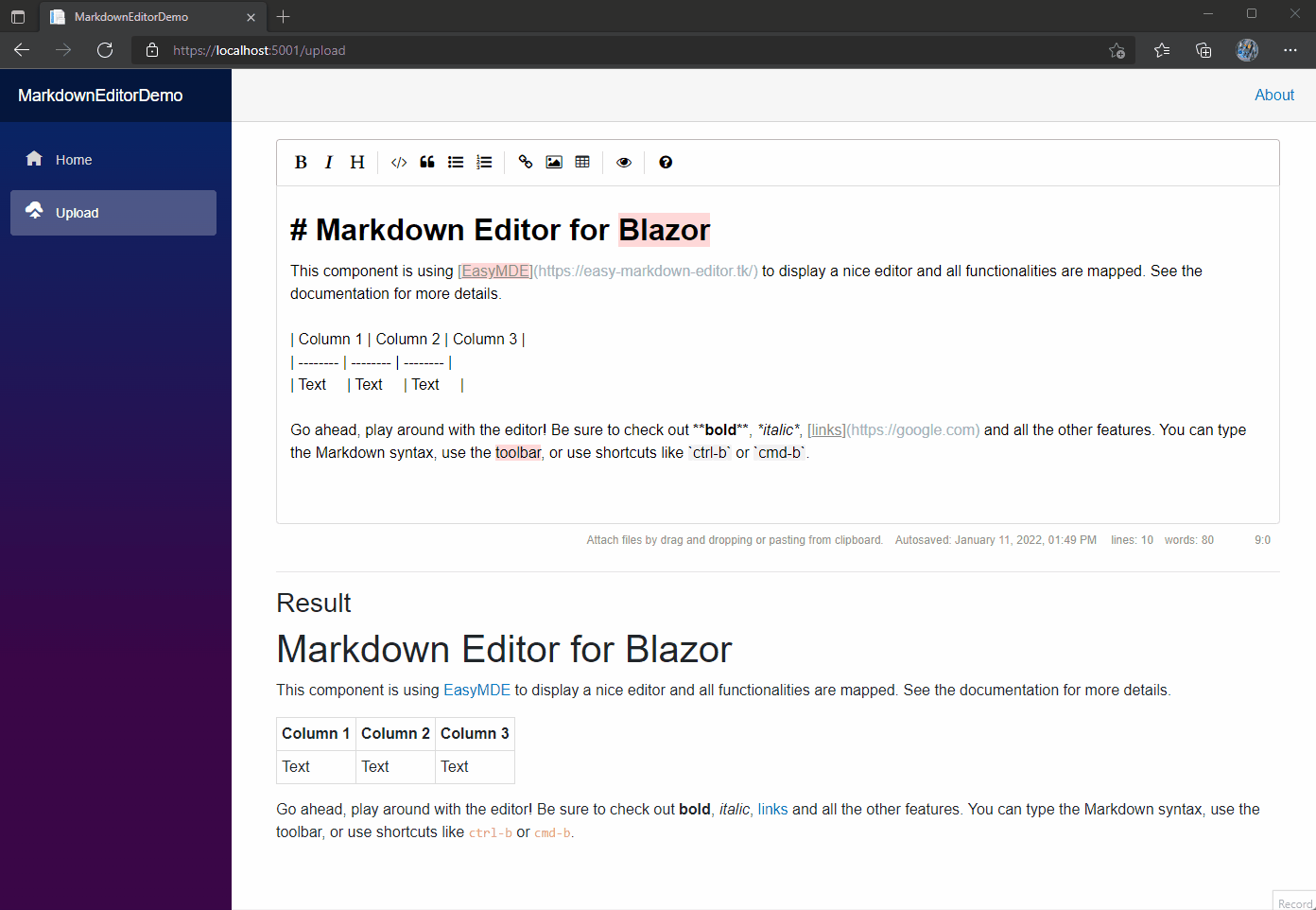
The result is a nice Markdown Editor like in the following screenshot. This is a screenshot from the demo in this repository.

Documentation
The Markdown Editor for Blazor has a estensive collection of properties to map all the functionalities in the JavaScript version. In this repository, there are 2 projects:
- MarkdownEditorDemo is a Blazor Web Assembly project that contains 2 pages:
Index.razorwhere I show how to use the component with the basic functions andUpload.razorthat shows how to cope with the image upload. To test the upload, the projectMarkdownEditorDemo.Apimust run - MarkdownEditorDemo.Api this is an ASP.NET Core WebApi (.NET6) how to implement a proper API for uploading images. For more details, I wrote a post about Uploading image with .NET.
Properties
| Name | Description | Type | Default |
|---|---|---|---|
| AutoSaveEnabled | Gets or sets the setting for the auto save. Saves the text that's being written and will load it back in the future. It will forget the text when the form it's contained in is submitted. Recommended to choose a unique ID for the Markdown Editor. | bool | false |
| AutoSaveId | Gets or sets the automatic save identifier. You must set a unique string identifier so that the component can autosave. Something that separates this from other instances of the component elsewhere on your website. | string | Default value |
| AutoSaveDelay | Delay between saves, in milliseconds. Defaults to 10000 (10s). | int | 10000 (10s) |
| AutoSaveSubmitDelay | Delay before assuming that submit of the form failed and saving the text, in milliseconds. | int | 5000 (5s) |
| AutoSaveText | Text for autosave | string | Autosaved: |
| AutoSaveTimeFormatLocale | Set the format for the datetime to display. For more info, see the JavaScript documentation DateTimeFormat instances | string | en-US |
| AutoSaveTimeFormatYear | Set the format for the year | string | numeric |
| AutoSaveTimeFormatMonth | Set the format for the month | string | long |
| AutoSaveTimeFormatDay | Set the format for the day | string | 2-digit |
| AutoSaveTimeFormatHour | Set the format for the hour | string | 2-digit |
| AutoSaveTimeFormatMinute | Set the format for the minute | string | 2-digit |
| AutoDownloadFontAwesome | If set to true, force downloads Font Awesome (used for icons). If set to false, prevents downloading. | bool? | null |
| CustomButtonClicked | Occurs after the custom toolbar button is clicked. | EventCallback<MarkdownButtonEventArgs> | |
| Direction | rtl or ltr. Changes text direction to support right-to-left languages. Defaults to ltr. | string | ltr |
| ErrorMessages | Errors displayed to the user, using the errorCallback option, where image_name, image_size and image_max_size will be replaced by their respective values, that can be used for customization or internationalization. | MarkdownErrorMessages | |
| HideIcons | An array of icon names to hide. Can be used to hide specific icons shown by default without completely customizing the toolbar. | string[] | 'side-by-side', 'fullscreen' |
| ImageAccept | A comma-separated list of mime-types used to check image type before upload (note: never trust client, always check file types at server-side). Defaults to image/png, image/jpeg, image/jpg, image.gif. | string | image/png, image/jpeg, image/jpg, image.gif |
| ImageCSRFToken | CSRF token to include with AJAX call to upload image. For instance, used with Django backend. | string | |
| ImageMaxSize | Maximum image size in bytes, checked before upload (note: never trust client, always check image size at server-side). Defaults to 1024 * 1024 * 2 (2Mb). | long | 1024 * 1024 * 2 (2Mb) |
| ImagePathAbsolute | If set to true, will treat imageUrl from imageUploadFunction and filePath returned from imageUploadEndpoint as an absolute rather than relative path, i.e. not prepend window.location.origin to it. | string | |
| ImageTexts | Texts displayed to the user (mainly on the status bar) for the import image feature, where image_name, image_size and image_max_size will be replaced by their respective values, that can be used for customization or internationalization. | MarkdownImageTexts | null |
| ImageUploadAuthenticationSchema | If an authentication for the API is required, assign to this property the schema to use. Bearer is the common one. |
string | empty |
| ImageUploadAuthenticationToken | If an authentication for the API is required, assign to this property the token | string | empty |
| LineNumbers | If set to true, enables line numbers in the editor. | bool | false |
| LineWrapping | If set to false, disable line wrapping. Defaults to true. | bool | false |
| MaxHeight | Sets fixed height for the composition area. minHeight option will be ignored. Should be a string containing a valid CSS value like "500px". Defaults to undefined. | string | |
| MaxUploadImageMessageSize | Gets or sets the max message size when uploading the file. | long | 20 * 1024 |
| MinHeight | Sets the minimum height for the composition area, before it starts auto-growing. Should be a string containing a valid CSS value like "500px". Defaults to "300px". | string | 300px |
| NativeSpellChecker | Enable (true) or disable (false) the spell check in the editor | bool | True |
| Placeholder | If set, displays a custom placeholder message. | string | null |
| SegmentFetchTimeout | Gets or sets the Segment Fetch Timeout when uploading the file. | TimeSpan | 1 min |
| ShowIcons | An array of icon names to show. Can be used to show specific icons hidden by default without completely customizing the toolbar. | string[] | 'code', 'table' |
| SpellChecker | Enable (true) or disable (false) the spell check in the editor | bool | True |
| TabSize | If set, customize the tab size. Defaults to 2. | int | 2 |
| Theme | Override the theme. Defaults to easymde. | string | easymde |
| Toolbar | [Optional] Gets or sets the content of the toolbar. | RenderFragment | |
| ToolbarTips | If set to false, disable toolbar button tips. Defaults to true. | bool | true |
| UploadImage | If set to true, enables the image upload functionality, which can be triggered by drag-drop, copy-paste and through the browse-file window (opened when the user clicks on the upload-image icon). Defaults to false. | bool | false |
| Value | Gets or sets the markdown value. | string | null |
| ValueHTML | Gets the HTML from the markdown value. | string | null |
Events
| Name | Description | Type |
|---|---|---|
| ErrorCallback | A callback function used to define how to display an error message. Defaults to (errorMessage) ⇒ alert(errorMessage). | Func<string, Task> |
| ImageUploadChanged | Occurs every time the selected image has changed. | Func<FileChangedEventArgs, Task> |
| ImageUploadEnded | Occurs when an individual image upload has ended. | Func<FileEndedEventArgs, Task> |
| ImageUploadEndpoint | The endpoint where the images data will be sent, via an asynchronous POST request. The server is supposed to save this image, and return a json response. | string |
| ImageUploadProgressed | Notifies the progress of image being written to the destination stream. | Func<FileProgressedEventArgs, Task> |
| ImageUploadStarted | Occurs when an individual image upload has started. | Func<FileStartedEventArgs, Task> |
| ValueChanged | An event that occurs after the markdown value has changed. | EventCallback<string> |
| ValueHTMLChanged | An event that occurs after the markdown value has changed and the new HTML code is available. | EventCallback<string> |
Upload file
The Markdown Editor for Blazor can take care of uploading a file and add the relative Markdown code in the editor. For that, the property UploadImage has to set to true. Also, the upload API must be specified in the property ImageUploadEndpoint.
In some cases, the API requires an authentication. The properties ImageUploadAuthenticationSchema and ImageUploadAuthenticationToken allow you to pass the correct schema and token to use in the call.
Those values will be added to the HttpClient POST request in the header. Only if both properties are not null, they will be added to the header.
If you want to understand better how to create the API for the upload, I have created a specific post on PureSourceCode.
Toolbar icons
Below are the built-in toolbar icons (only some of which are enabled by default), which can be reorganized however you like. "Name" is the name of the icon, referenced in the JS. "Action" is either a function or a URL to open. "Class" is the class given to the icon. "Tooltip" is the small tooltip that appears via the title="" attribute. Note that shortcut hints are added automatically and reflect the specified action if it has a key bind assigned to it (i.e. with the value of action set to bold and that of tooltip set to Bold, the final text the user will see would be "Bold (Ctrl-B)").
Additionally, you can add a separator between any icons by adding "|" to the toolbar array.
| Name | Action | Tooltip<br>Class |
|---|---|---|
| bold | toggleBold | Bold<br>fa fa-bold |
| italic | toggleItalic | Italic<br>fa fa-italic |
| strikethrough | toggleStrikethrough | Strikethrough<br>fa fa-strikethrough |
| heading | toggleHeadingSmaller | Heading<br>fa fa-header |
| heading-smaller | toggleHeadingSmaller | Smaller Heading<br>fa fa-header |
| heading-bigger | toggleHeadingBigger | Bigger Heading<br>fa fa-lg fa-header |
| heading-1 | toggleHeading1 | Big Heading<br>fa fa-header header-1 |
| heading-2 | toggleHeading2 | Medium Heading<br>fa fa-header header-2 |
| heading-3 | toggleHeading3 | Small Heading<br>fa fa-header header-3 |
| code | toggleCodeBlock | Code<br>fa fa-code |
| quote | toggleBlockquote | Quote<br>fa fa-quote-left |
| unordered-list | toggleUnorderedList | Generic List<br>fa fa-list-ul |
| ordered-list | toggleOrderedList | Numbered List<br>fa fa-list-ol |
| clean-block | cleanBlock | Clean block<br>fa fa-eraser |
| link | drawLink | Create Link<br>fa fa-link |
| image | drawImage | Insert Image<br>fa fa-picture-o |
| table | drawTable | Insert Table<br>fa fa-table |
| horizontal-rule | drawHorizontalRule | Insert Horizontal Line<br>fa fa-minus |
| preview | togglePreview | Toggle Preview<br>fa fa-eye no-disable |
| side-by-side | toggleSideBySide | Toggle Side by Side<br>fa fa-columns no-disable no-mobile |
| fullscreen | toggleFullScreen | Toggle Fullscreen<br>fa fa-arrows-alt no-disable no-mobile |
| guide | This link | Markdown Guide<br>fa fa-question-circle |
Keyboard shortcuts
EasyMDE comes with an array of predefined keyboard shortcuts, but they can be altered with a configuration option. The list of default ones is as follows:
| Shortcut (Windows / Linux) | Shortcut (macOS) | Action |
|---|---|---|
| Ctrl-' | Cmd-' | "toggleBlockquote" |
| Ctrl-B | Cmd-B | "toggleBold" |
| Ctrl-E | Cmd-E | "cleanBlock" |
| Ctrl-H | Cmd-H | "toggleHeadingSmaller" |
| Ctrl-I | Cmd-I | "toggleItalic" |
| Ctrl-K | Cmd-K | "drawLink" |
| Ctrl-L | Cmd-L | "toggleUnorderedList" |
| Ctrl-P | Cmd-P | "togglePreview" |
| Ctrl-Alt-C | Cmd-Alt-C | "toggleCodeBlock" |
| Ctrl-Alt-I | Cmd-Alt-I | "drawImage" |
| Ctrl-Alt-L | Cmd-Alt-L | "toggleOrderedList" |
| Shift-Ctrl-H | Shift-Cmd-H | "toggleHeadingBigger" |
| F9 | F9 | "toggleSideBySide" |
| F11 | F11 | "toggleFullScreen" |
Other Blazor components
- DataTable for Blazor: DataTable component for Blazor WebAssembly and Blazor Server
- Markdown editor for Blazor: This is a Markdown Editor for use in Blazor. It contains a live preview as well as an embeded help guide for users.
- Modal dialog for Blazor: Simple Modal Dialog for Blazor WebAssembly
- PSC.Extensions: A lot of functions for .NET6 in a NuGet package that you can download for free. We collected in this package functions for everyday work to help you with claim, strings, enums, date and time, expressions…
- Quill for Blazor: Quill Component is a custom reusable control that allows us to easily consume Quill and place multiple instances of it on a single page in our Blazor application
- Segment for Blazor: This is a Segment component for Blazor Web Assembly and Blazor Server
- Tabs for Blazor: This is a Tabs component for Blazor Web Assembly and Blazor Server
More examples and documentation
- Write a reusable Blazor component
- Getting Started With C# And Blazor
- Setting Up A Blazor WebAssembly Application
- Working With Blazor Component Model
- Secure Blazor WebAssembly With IdentityServer4
- Blazor Using HttpClient With Authentication
- InputSelect component for enumerations in Blazor
- Use LocalStorage with Blazor WebAssembly
- Modal Dialog component for Blazor
- Create Tooltip component for Blazor
- Consume ASP.NET Core Razor components from Razor class libraries | Microsoft Docs
| Product | Versions Compatible and additional computed target framework versions. |
|---|---|
| .NET | net6.0 is compatible. net6.0-android was computed. net6.0-ios was computed. net6.0-maccatalyst was computed. net6.0-macos was computed. net6.0-tvos was computed. net6.0-windows was computed. net7.0 was computed. net7.0-android was computed. net7.0-ios was computed. net7.0-maccatalyst was computed. net7.0-macos was computed. net7.0-tvos was computed. net7.0-windows was computed. net8.0 was computed. net8.0-android was computed. net8.0-browser was computed. net8.0-ios was computed. net8.0-maccatalyst was computed. net8.0-macos was computed. net8.0-tvos was computed. net8.0-windows was computed. |
-
net6.0
- Markdig (>= 0.26.0)
- Microsoft.AspNetCore.Components.Web (>= 6.0.1)
- PSC.Blazor.Components.Common (>= 6.0.4)
NuGet packages
This package is not used by any NuGet packages.
GitHub repositories (1)
Showing the top 1 popular GitHub repositories that depend on PSC.Blazor.Components.MarkdownEditor:
| Repository | Stars |
|---|---|
|
FritzAndFriends/TagzApp
An application that discovers content on social media for hashtags
|
| Version | Downloads | Last updated |
|---|---|---|
| 8.0.0 | 60 | 4/18/2024 |
| 2.0.20 | 396 | 4/11/2024 |
| 2.0.19 | 8,800 | 10/23/2023 |
| 2.0.18 | 352 | 10/13/2023 |
| 2.0.17 | 1,169 | 10/3/2023 |
| 2.0.15 | 104 | 10/3/2023 |
| 2.0.14 | 105 | 10/3/2023 |
| 2.0.13 | 204 | 9/30/2023 |
| 2.0.12 | 313 | 9/22/2023 |
| 2.0.11 | 12,214 | 6/8/2023 |
| 2.0.10 | 17,281 | 5/16/2022 |
| 2.0.9 | 965 | 3/3/2022 |
| 2.0.8 | 431 | 2/22/2022 |
| 2.0.7 | 426 | 2/22/2022 |
| 2.0.6 | 525 | 1/25/2022 |
| 2.0.5 | 437 | 1/25/2022 |
| 2.0.4 | 432 | 1/21/2022 |
| 2.0.3 | 459 | 1/11/2022 |
| 2.0.2 | 431 | 1/11/2022 |
| 2.0.1 | 432 | 1/11/2022 |
| 1.0.1 | 429 | 11/5/2021 |
Fix the bindable Value